 |
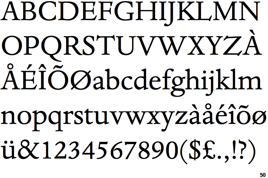
The '&' (ampersand) is traditional style with two enclosed loops.
|
 |
The verticals of the upper-case 'M' are parallel.
|
 |
The lower-case 'e' has a straight horizontal bar.
|
 |
The leg of the upper-case 'K' has two serifs.
|
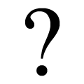 |
The '?' (question-mark) is hook-shaped.
|
 |
The base of the '2' has an upward-pointing serif.
|
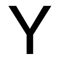 |
The arms of the upper-case 'Y' are straight.
|
Note that the fonts in the icons shown above represent general examples, not necessarily the two fonts chosen for comparison.
Show Examples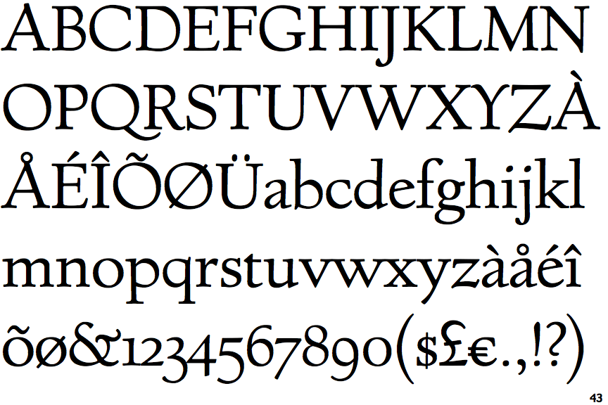
 |
The '&' (ampersand) is traditional style with a gap at the top.
|
 |
The verticals of the upper-case 'M' are sloping.
|
 |
The lower-case 'e' has a straight angled bar.
|
 |
The leg of the upper-case 'K' has a single right-pointing serif or foot.
|
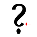 |
The '?' (question-mark) is like a backwards 'S'.
|
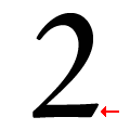 |
The base of the '2' has no serif.
|
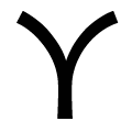 |
The arms of the upper-case 'Y' are curved, convex.
|