 |
The '&' (ampersand) looks like 'Et' with one enclosed loop (with or without exit stroke).
|
 |
The centre bar of the upper-case 'P' leaves a gap with the vertical.
|
 |
The centre vertex of the upper-case 'W' has no serifs.
|
 |
The upper-case 'C' is symmetrical about a horizontal axis.
|
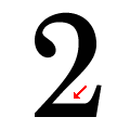 |
The base of the '2' is straight.
|
 |
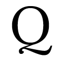
The tail of the upper-case 'Q' is single-sided.
|
 |
The foot of the '£' (pound) has no loop.
|
Note that the fonts in the icons shown above represent general examples, not necessarily the two fonts chosen for comparison.
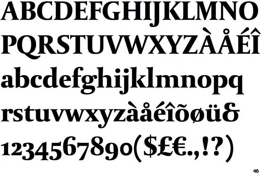
Show Examples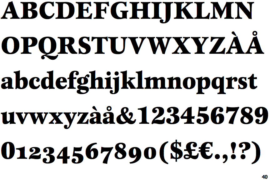
 |
The '&' (ampersand) is traditional style with two enclosed loops.
|
 |
The centre bar of the upper-case 'P' meets the vertical.
|
 |
The centre vertex of the upper-case 'W' has two separate serifs.
|
 |
The upper-case 'C' is asymmetrical about a horizontal axis.
|
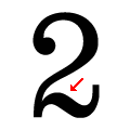 |
The base of the '2' is curved.
|
 |
The tail of the upper-case 'Q' is Z-shaped.
|
 |
The foot of the '£' (pound) has a loop.
|