Identifont

Fonts by Appearance

Fonts by Name

Fonts by Similarity

Fonts by Picture

Fonts by Designer/Publisher

Differences

TweetTweet Differences

Compare: and  

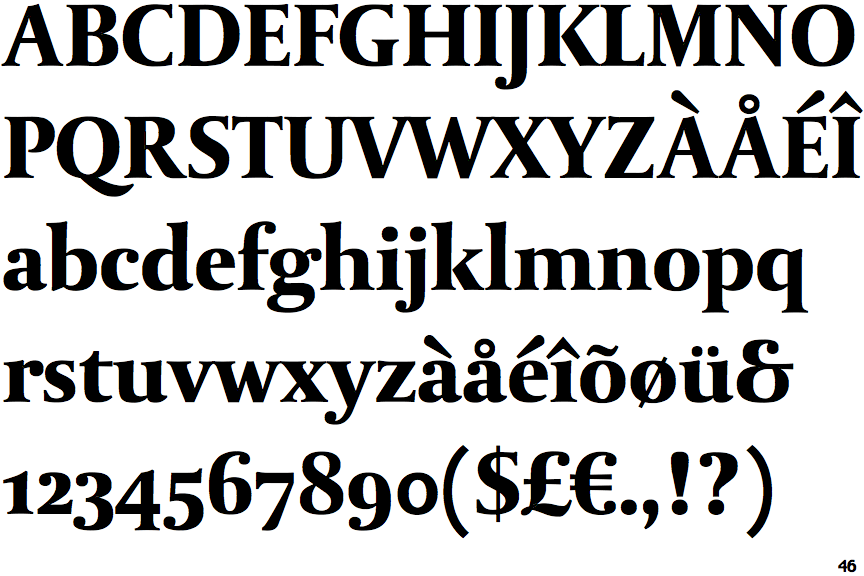
DTL Paradox OSF Black

DTL Paradox OSF Black

Et shaped
The '&' (ampersand) looks like 'Et' with one enclosed loop (with or without exit stroke).
Below
The upper-case 'J' descends below the baseline.
Gap
The centre bar of the upper-case 'P' leaves a gap with the vertical.
Double
The foot of the '4' has double-sided serifs.
Symmetrical
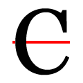
The upper-case 'C' is symmetrical about a horizontal axis.

Note that the fonts in the icons shown above represent general examples, not necessarily the two fonts chosen for comparison.

Show Examples
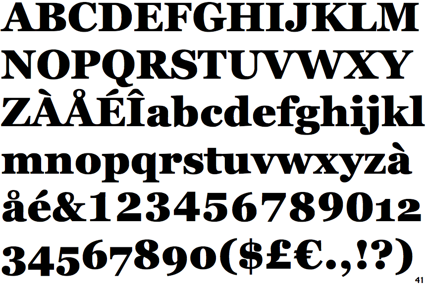
Georgia Pro Black

Georgia Pro Black

Closed
The '&' (ampersand) is traditional style with two enclosed loops.
On
The upper-case 'J' sits on the baseline.
Meets
The centre bar of the upper-case 'P' meets the vertical.
None
The foot of the '4' has no serifs.
Asymmetrical
The upper-case 'C' is asymmetrical about a horizontal axis.