 |
The upper-case 'Q' tail crosses the circle.
|
 |
The '$' (dollar) has a double line crossing the 'S'.
|
 |
The dot on the '?' (question-mark) is square or rectangular.
|
 |
The verticals of the upper-case 'M' are parallel.
|
 |
The dot on the lower-case 'i' or 'j' is square or rectangular.
|
 |
The right side of the upper-case 'G' is curved.
|
 |
The tail of the lower-case 'f' sits on the baseline.
|
 |
The lower-case 'w' vertices are pointed at the top, flat at the bottom.
|
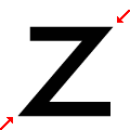 |
The vertices of the lower-case 'z' are pointed.
|
 |
The foot of the '£' (pound) has a loop.
|
Note that the fonts in the icons shown above represent general examples, not necessarily the two fonts chosen for comparison.
Show Examples
 |
The upper-case 'Q' tail touches the circle.
|
 |
The '$' (dollar) has a single line which does not cross the 'S'.
|
 |
The dot on the '?' (question-mark) is circular or oval.
|
 |
The verticals of the upper-case 'M' are sloping.
|
 |
The dot on the lower-case 'i' or 'j' is circular or oval.
|
 |
The right side of the upper-case 'G' has a flat section.
|
 |
The tail of the lower-case 'f' descends below the baseline.
|
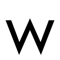 |
The lower-case 'w' vertices are pointed at the top and bottom.
|
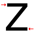 |
The vertices of the lower-case 'z' are flat.
|
 |
The foot of the '£' (pound) has no loop.
|