Identifont

Fonts by Appearance

Fonts by Name

Fonts by Similarity

Fonts by Picture

Fonts by Designer/Publisher

Differences

TweetTweet Differences

Compare: and  

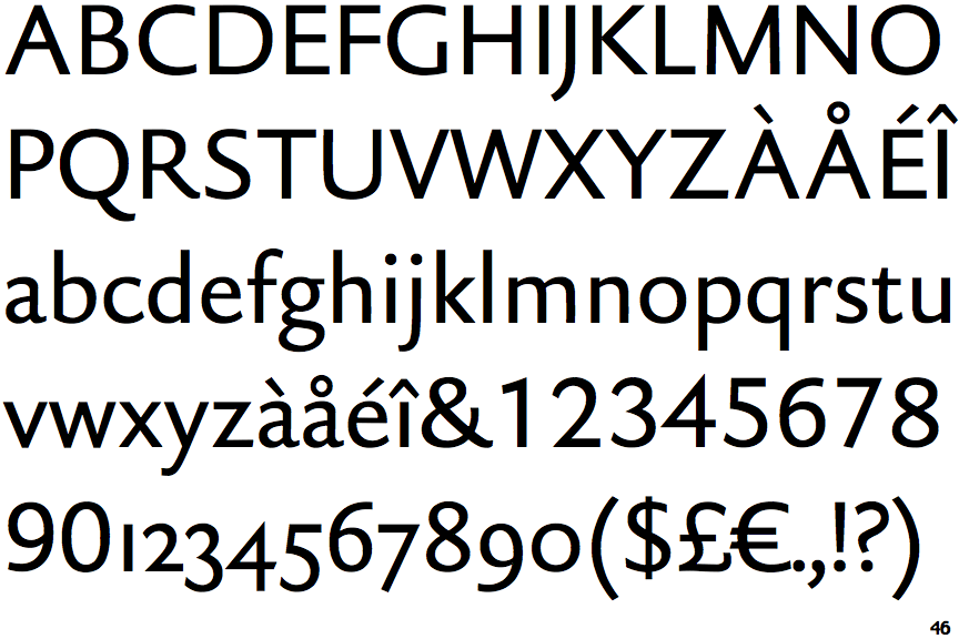
DTL Haarlemmer Sans

DTL Haarlemmer Sans

Below
The upper-case 'J' descends below the baseline.
Circle
The dot on the '?' (question-mark) is circular or oval.
2-Storey
The lower-case 'g' is double-storey (with or without gap).
Inwards
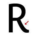
The leg of the upper-case 'R' is curved inwards.
Circle
The dot on the lower-case 'i' or 'j' is circular or oval.

Note that the fonts in the icons shown above represent general examples, not necessarily the two fonts chosen for comparison.

Show Examples
ITC Quay Sans (Linotype)

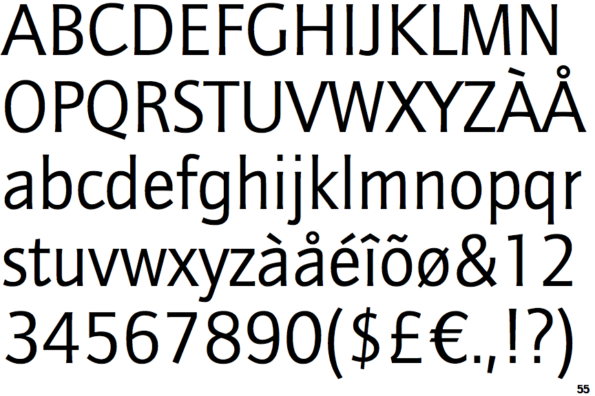
ITC Quay Sans (Linotype)

On
The upper-case 'J' sits on the baseline.
Square/rectangular
The dot on the '?' (question-mark) is square or rectangular.
1-Storey
The lower-case 'g' is single-storey (with or without loop).
Outwards
The leg of the upper-case 'R' is curved outwards.
Square/rectangle
The dot on the lower-case 'i' or 'j' is square or rectangular.