 |
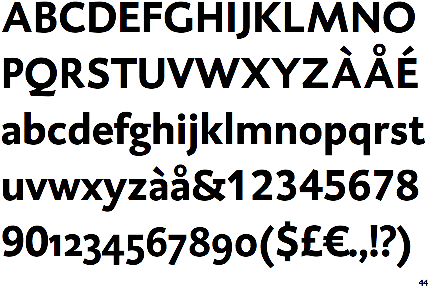
The upper-case 'Q' tail touches the circle.
|
 |
The '&' (ampersand) is traditional style with a gap at the top.
|
 |
The dot on the '?' (question-mark) is circular or oval.
|
 |
The verticals of the upper-case 'M' are sloping.
|
 |
The lower-case 'g' is double-storey (with or without gap).
|
 |
The dot on the lower-case 'i' or 'j' is circular or oval.
|
 |
The tail of the lower-case 'y' is curved or U-shaped to the left.
|
 |
The tail of the lower-case 'f' sits on the baseline.
|
 |
The centre strokes of the upper-case 'W' meet at a vertex.
|
Note that the fonts in the icons shown above represent general examples, not necessarily the two fonts chosen for comparison.
Show Examples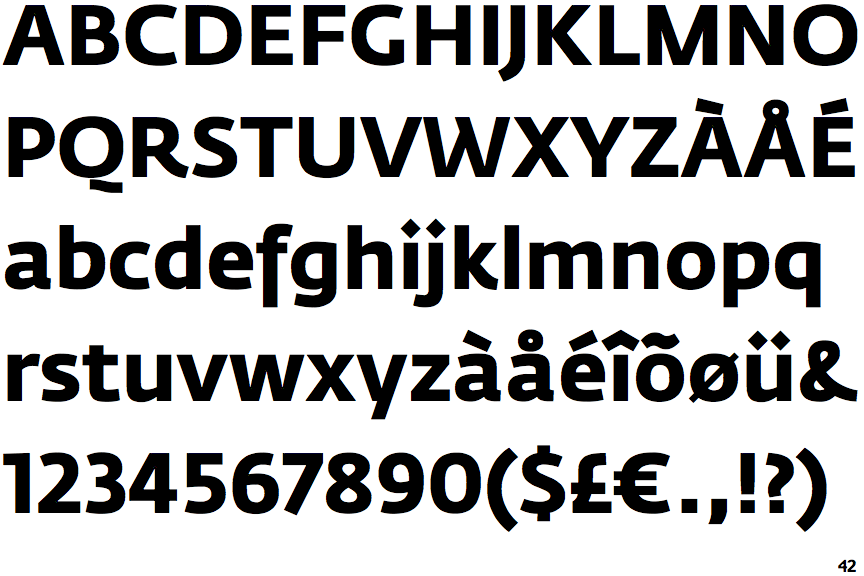
 |
The upper-case 'Q' tail is below and separated from the circle.
|
 |
The '&' (ampersand) is traditional style with two enclosed loops.
|
 |
The dot on the '?' (question-mark) is square or rectangular.
|
 |
The verticals of the upper-case 'M' are parallel.
|
 |
The lower-case 'g' is single-storey (with or without loop).
|
 |
The dot on the lower-case 'i' or 'j' is diamond-shaped.
|
 |
The tail of the lower-case 'y' is substantially straight.
|
 |
The tail of the lower-case 'f' descends below the baseline.
|
 |
The centre strokes of the upper-case 'W' meet in a T on the left.
|