Identifont

Fonts by Appearance

Fonts by Name

Fonts by Similarity

Fonts by Picture

Fonts by Designer/Publisher

Differences

TweetTweet Differences

Compare: and  

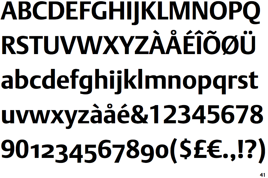
DTL Argo Bold

DTL Argo Bold

Below
The upper-case 'J' descends below the baseline.
Single
The diagonal strokes of the upper-case 'K' meet at the vertical (with or without a gap).
Baseline
The centre vertex of the upper-case 'M' is on the baseline.
Plain
The 'l' (lower-case 'L') has no serifs or tail.

Note that the fonts in the icons shown above represent general examples, not necessarily the two fonts chosen for comparison.

Show Examples
Barna Bold

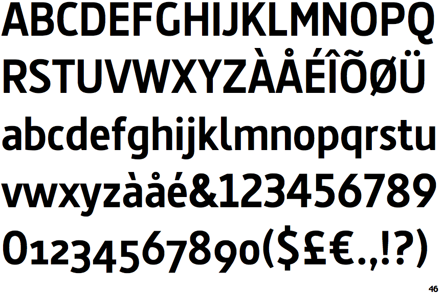
Barna Bold

On
The upper-case 'J' sits on the baseline.
Double
The diagonal strokes of the upper-case 'K' meet in a 'T'.
Above
The centre vertex of the upper-case 'M' is above the baseline.
Right
The 'l' (lower-case 'L') has a right-facing lower serif or tail.