Identifont

Fonts by Appearance

Fonts by Name

Fonts by Similarity

Fonts by Picture

Fonts by Designer/Publisher

Differences

TweetTweet Differences

Compare: and  

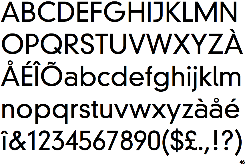
DIN Neuzeit Grotesk Light

DIN Neuzeit Grotesk Light

Crosses
The upper-case 'Q' tail crosses the circle.
Angled
The top storey of the '3' is a sharp angle.
Right
The 'l' (lower-case 'L') has a right-facing lower serif or tail.
Single-bar
The upper-case 'J' has a bar to the left.
Curved
The right side of the upper-case 'G' is curved.

Note that the fonts in the icons shown above represent general examples, not necessarily the two fonts chosen for comparison.

Show Examples
Avenir

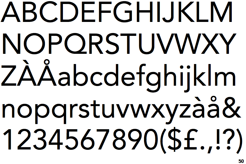
Avenir

Touches
The upper-case 'Q' tail touches the circle.
Round
The top storey of the '3' is a smooth curve.
Plain
The 'l' (lower-case 'L') has no serifs or tail.
Plain
The upper-case 'J' has no bar.
Flat
The right side of the upper-case 'G' has a flat section.