 |
The upper-case 'Q' tail is below and separated from the circle.
|
 |
The '$' (dollar) has a single line crossing the 'S'.
|
 |
The diagonal strokes of the upper-case 'K' meet at the vertical (with or without a gap).
|
 |
The centre bar of the upper-case 'P' leaves a gap with the vertical.
|
 |
The top stroke of the upper-case 'C' has no upward-pointing serif.
|
 |
The centre bar of the upper-case 'R' leaves a gap with the vertical.
|
 |
The foot of the '4' has double-sided serifs.
|
 |
The centre vertex of the upper-case 'W' has no serifs.
|
 |
The lower storey of the lower-case 'g' has a gap.
|
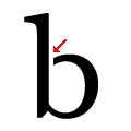 |
The bowl of the lower-case 'b' has an upper gap.
|
There are more than ten differences; only the first ten are shown.
Note that the fonts in the icons shown above represent general examples, not necessarily the two fonts chosen for comparison.
Show Examples
 |
The upper-case 'Q' tail touches the circle.
|
 |
The '$' (dollar) has a double line crossing the 'S'.
|
 |
The diagonal strokes of the upper-case 'K' meet in a 'T'.
|
 |
The centre bar of the upper-case 'P' meets the vertical.
|
 |
The top stroke of the upper-case 'C' has a vertical or angled upward-pointing serif.
|
 |
The centre bar of the upper-case 'R' meets the vertical.
|
 |
The foot of the '4' has no serifs.
|
 |
The centre vertex of the upper-case 'W' has two separate serifs.
|
 |
The lower storey of the lower-case 'g' has no gap.
|
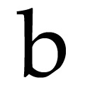 |
The bowl of the lower-case 'b' has no gap.
|