Identifont

Fonts by Appearance

Fonts by Name

Fonts by Similarity

Fonts by Picture

Fonts by Designer/Publisher

Differences

TweetTweet Differences

Compare: and  

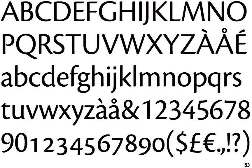
Cronos Display

Cronos Display

Sloping
The verticals of the upper-case 'M' are sloping.
Gap
The centre bar of the upper-case 'P' leaves a gap with the vertical.
No bar
The upper-case 'G' has no bar.
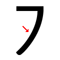
Convex
The stem of the '7' is curved outwards.

Note that the fonts in the icons shown above represent general examples, not necessarily the two fonts chosen for comparison.

Show Examples
Nara Sans

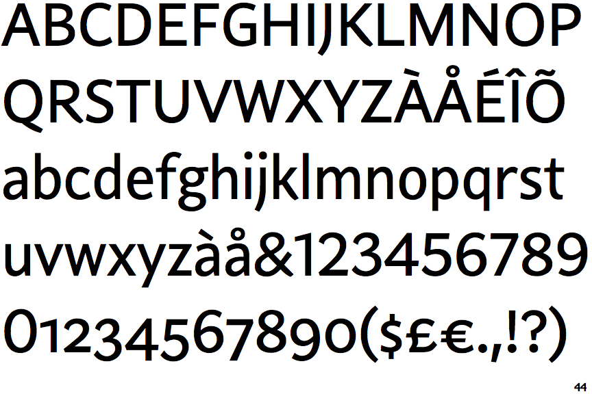
Nara Sans

Parallel
The verticals of the upper-case 'M' are parallel.
Meets
The centre bar of the upper-case 'P' meets the vertical.
Left
The upper-case 'G' has a bar to the left.
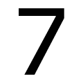
Straight
The stem of the '7' is straight.