 |
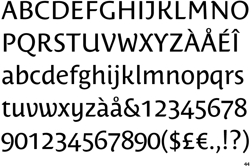
The '&' (ampersand) is traditional style with a gap at the top.
|
 |
The diagonal strokes of the upper-case 'K' meet in a 'T'.
|
 |
The centre vertex of the upper-case 'M' is above the baseline.
|
 |
The centre bar of the upper-case 'P' leaves a gap with the vertical.
|
 |
The upper-case 'U' has a stem/serif.
|
 |
The upper-case 'G' has no bar.
|
 |
The upper-case 'J' has a bar to the left.
|
 |
The leg of the upper-case 'R' is curved inwards.
|
 |
The lower-case 'i' has a right-facing lower serif or tail.
|
Note that the fonts in the icons shown above represent general examples, not necessarily the two fonts chosen for comparison.
Show Examples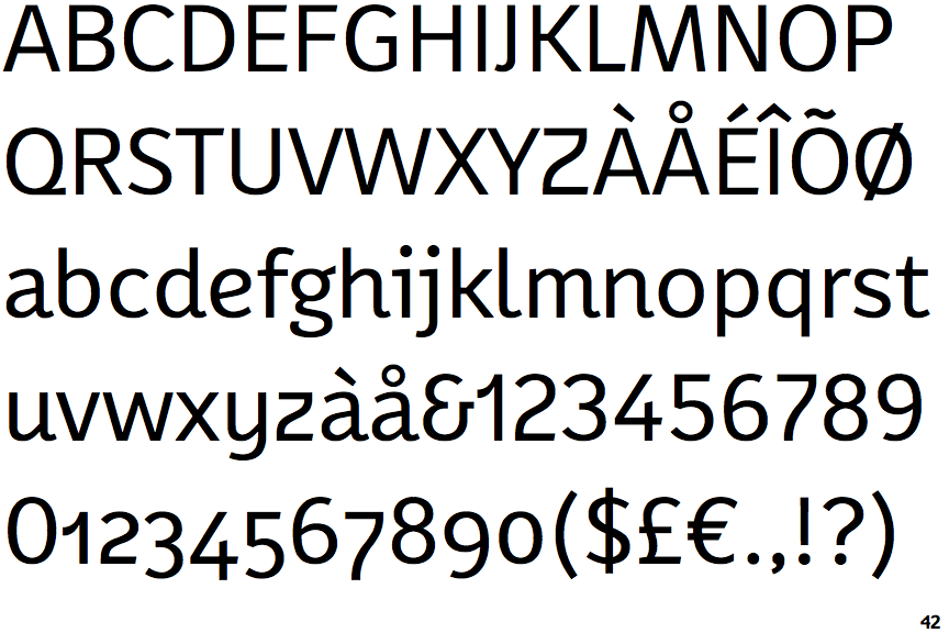
 |
The '&' (ampersand) looks like 'Et' with a gap at the top.
|
 |
The diagonal strokes of the upper-case 'K' connect to the vertical via a horizontal bar.
|
 |
The centre vertex of the upper-case 'M' is on the baseline.
|
 |
The centre bar of the upper-case 'P' meets the vertical.
|
 |
The upper-case 'U' has no stem/serif.
|
 |
The upper-case 'G' has a bar to the left.
|
 |
The upper-case 'J' has no bar.
|
 |
The leg of the upper-case 'R' is straight.
|
 |
The lower-case 'i' has a left-facing upper serif.
|