 |
The verticals of the upper-case 'M' are parallel.
|
 |
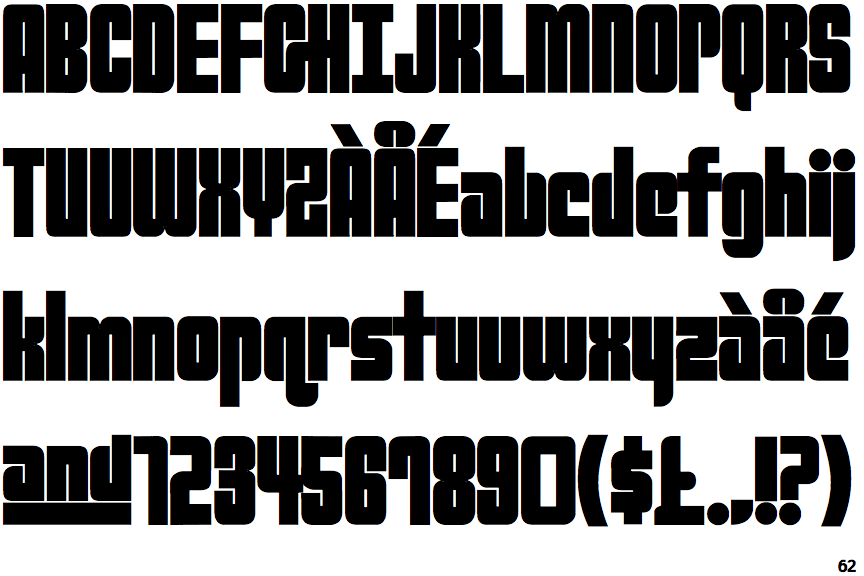
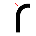
The upper-case 'G' has a bar to the right.
|
 |
The upper-case 'A' has parallel verticals.
|
 |
The upper-case letter 'I' has serifs/bars.
|
 |
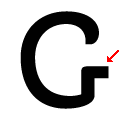
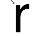
The lower-case 'r' has no spur or serif.
|
Note that the fonts in the icons shown above represent general examples, not necessarily the two fonts chosen for comparison.
Show Examples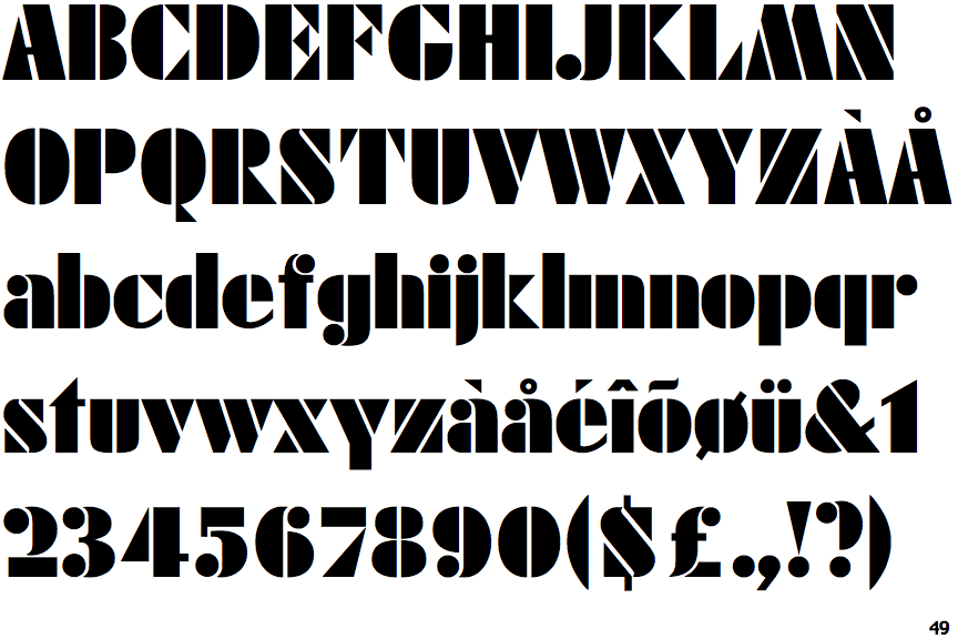
 |
The verticals of the upper-case 'M' are sloping.
|
 |
The upper-case 'G' has no bar.
|
 |
The upper-case 'A' has tapered verticals.
|
 |
The upper-case letter 'I' is plain.
|
 |
The lower-case 'r' has a vertical spur.
|