 |
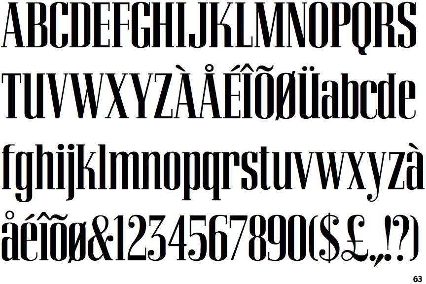
The upper-case 'Q' tail touches the circle.
|
 |
The '&' (ampersand) is traditional style with two enclosed loops.
|
 |
The top storey of the '3' is a sharp angle.
|
 |
The upper-case 'U' has a stem/serif.
|
 |
The characters are solid.
|
 |
The top of the upper-case 'A' has serifs both sides, or a top bar.
|
 |
The bar of the upper-case 'G' is single-sided, left-facing.
|
 |
The foot of the '£' (pound) has an open loop.
|
Note that the fonts in the icons shown above represent general examples, not necessarily the two fonts chosen for comparison.
Show Examples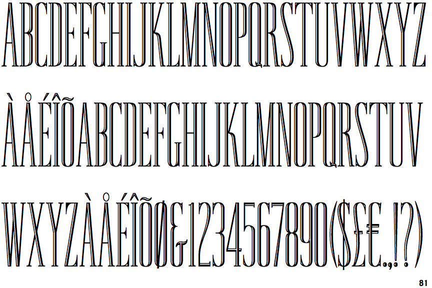
 |
The upper-case 'Q' tail crosses the circle.
|
 |
The '&' (ampersand) looks like 'Et' with a gap at the top.
|
 |
The top storey of the '3' is a smooth curve.
|
 |
The upper-case 'U' has no stem/serif.
|
 |
The characters are outlined, shaded, or filled with a pattern.
|
 |
The top of the upper-case 'A' has no serifs or cusps.
|
 |
The bar of the upper-case 'G' is double-sided.
|
 |
The foot of the '£' (pound) has no open loop.
|