 |
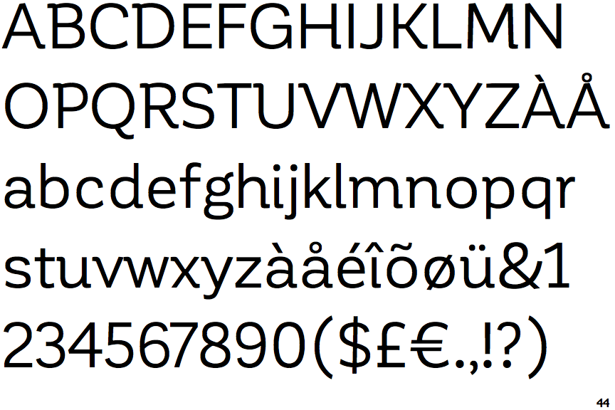
The '&' (ampersand) is traditional style with two enclosed loops.
|
 |
The '4' is closed.
|
 |
The centre vertex of the upper-case 'M' is above the baseline.
|
 |
The upper-case 'G' has a spur/tail.
|
 |
The leg of the upper-case 'R' is curved inwards.
|
 |
The top of the lower-case 'q' has no spur or serif.
|
 |
The sides of the lower-case 'y' are angled (V-shaped).
|
 |
The lower storey of the lower-case 'g' has no gap.
|
 |
The '1' (digit one) has double-sided base or serifs.
|
 |
The lower-case 'i' has a right-facing lower serif or tail.
|
Note that the fonts in the icons shown above represent general examples, not necessarily the two fonts chosen for comparison.
Show Examples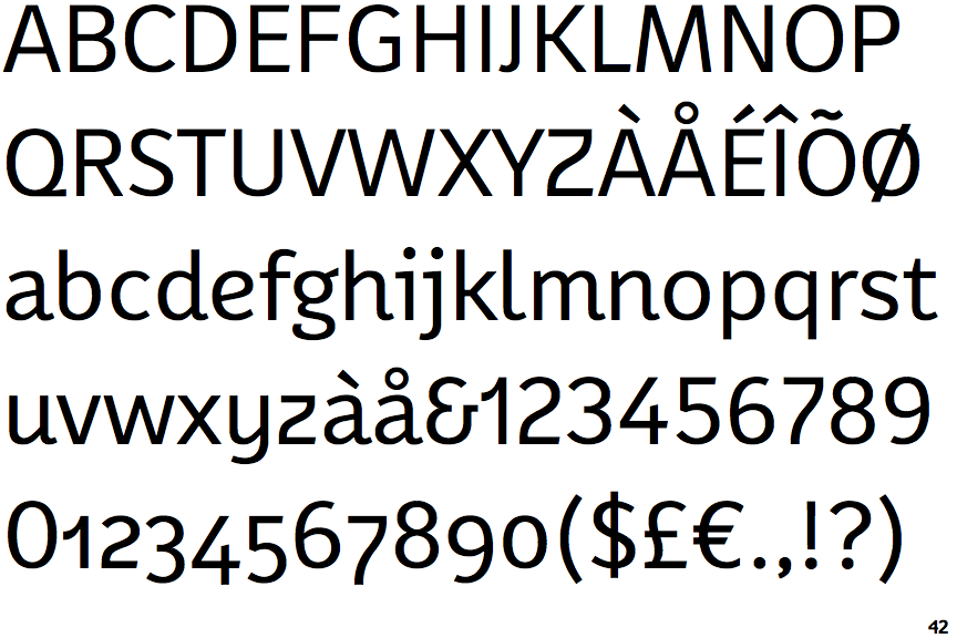
 |
The '&' (ampersand) looks like 'Et' with a gap at the top.
|
 |
The '4' is open.
|
 |
The centre vertex of the upper-case 'M' is on the baseline.
|
 |
The upper-case 'G' has no spur/tail.
|
 |
The leg of the upper-case 'R' is straight.
|
 |
The top of the lower-case 'q' has a vertical or slightly angled spur (pointed or flat).
|
 |
The sides of the lower-case 'y' are parallel (U-shaped).
|
 |
The lower storey of the lower-case 'g' has a gap.
|
 |
The '1' (digit one) has no base.
|
 |
The lower-case 'i' has a left-facing upper serif.
|