Identifont

Fonts by Appearance

Fonts by Name

Fonts by Similarity

Fonts by Picture

Fonts by Designer/Publisher

Differences

TweetTweet Differences

Compare: and  

Corporate A

Corporate A

Closed
The '4' is closed.
Top serif
The top stroke of the upper-case 'C' has a vertical or angled upward-pointing serif.
Serif
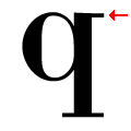
The top of the lower-case 'q' has a right-facing serif.
None
The foot of the '4' has no serifs.
One
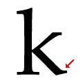
The leg of the lower-case 'k' has single right-pointing lower serif or foot.

Note that the fonts in the icons shown above represent general examples, not necessarily the two fonts chosen for comparison.

Show Examples
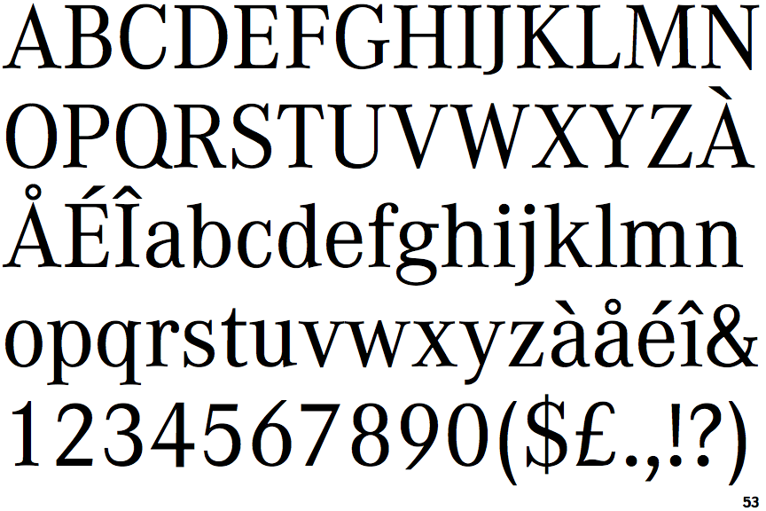
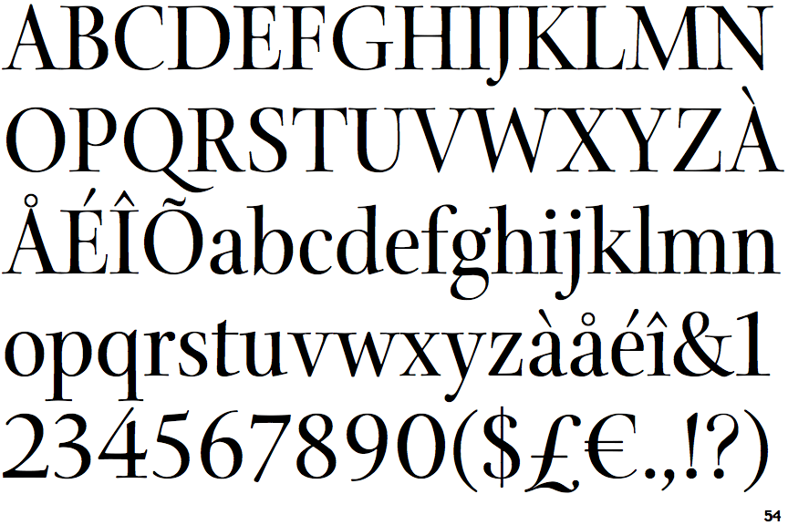
Arepo

Arepo

Open
The '4' is open.
No top serif
The top stroke of the upper-case 'C' has no upward-pointing serif.
Spur
The top of the lower-case 'q' has a vertical or slightly angled spur (pointed or flat).
Double
The foot of the '4' has double-sided serifs.
Two
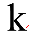
The leg of the lower-case 'k' has two lower serifs.