Identifont

Fonts by Appearance

Fonts by Name

Fonts by Similarity

Fonts by Picture

Fonts by Designer/Publisher

Differences

TweetTweet Differences

Compare: and  

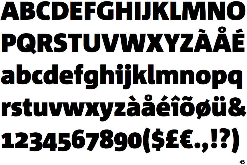
Corpid Black

Corpid Black

Double
The diagonal strokes of the upper-case 'K' meet in a 'T'.
Sloping
The verticals of the upper-case 'M' are sloping.
Right
The 'l' (lower-case 'L') has a right-facing lower serif or tail.
Stem
The lower-case 'u' has a stem/serif.
One
The lower-case 'i' has a left-facing upper serif.

Note that the fonts in the icons shown above represent general examples, not necessarily the two fonts chosen for comparison.

Show Examples
Sense Black

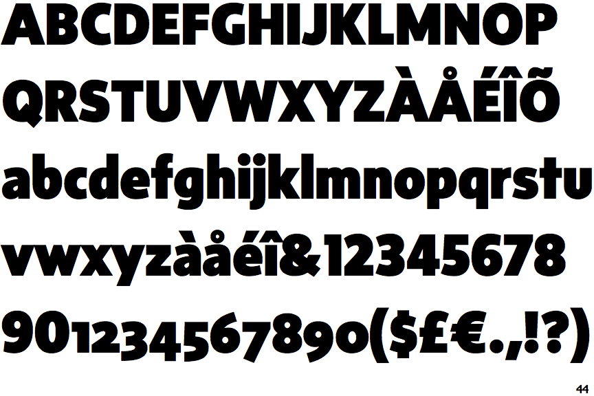
Sense Black

Single
The diagonal strokes of the upper-case 'K' meet at the vertical (with or without a gap).
Parallel
The verticals of the upper-case 'M' are parallel.
Plain
The 'l' (lower-case 'L') has no serifs or tail.
No-Stem
The lower-case 'u' has no stem/serif.
Plain
The lower-case 'i' has no serifs or tail.