 |
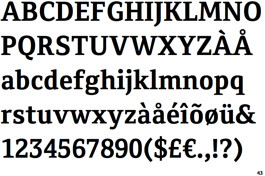
The '&' (ampersand) is traditional style with a gap at the top.
|
 |
The centre vertex of the upper-case 'M' is above the baseline.
|
 |
The verticals of the upper-case 'M' are sloping.
|
 |
The top storey of the '3' is a sharp angle.
|
 |
The centre bar of the upper-case 'E' has no serifs.
|
 |
The top of the lower-case 'q' has no spur or serif.
|
 |
The bar of the upper-case 'G' is single-sided, left-facing.
|
 |
The feet of the lower-case 'h' have two serifs on the left and one on the right.
|
 |
The centre bar of the upper-case 'F' has no serifs.
|
 |
The feet of the lower-case 'm' have two serifs on the left, and one on the centre and right.
|
Note that the fonts in the icons shown above represent general examples, not necessarily the two fonts chosen for comparison.
Show Examples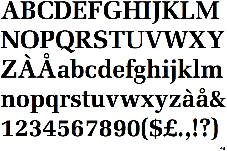
 |
The '&' (ampersand) is traditional style with two enclosed loops.
|
 |
The centre vertex of the upper-case 'M' is on the baseline.
|
|
The verticals of the upper-case 'M' are parallel.
|
 |
The top storey of the '3' is a smooth curve.
|
 |
The centre bar of the upper-case 'E' has serifs.
|
 |
The top of the lower-case 'q' has a vertical or slightly angled spur (pointed or flat).
|
 |
The bar of the upper-case 'G' is double-sided.
|
 |
The feet of the lower-case 'h' have two serifs on each foot.
|
 |
The centre bar of the upper-case 'F' has serifs.
|
 |
The feet of the lower-case 'm' have two serifs on each foot.
|