Identifont

Fonts by Appearance

Fonts by Name

Fonts by Similarity

Fonts by Picture

Fonts by Designer/Publisher

Differences

TweetTweet Differences

Compare: and  

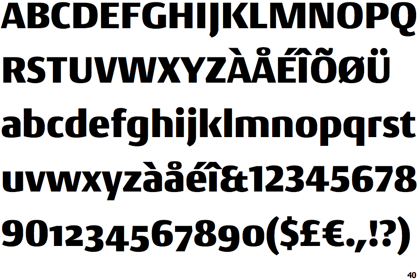
Conto Black

Conto Black

Et shaped
The '&' (ampersand) looks like 'Et' with one enclosed loop (with or without exit stroke).
Below
The upper-case 'J' descends below the baseline.
No bar
The upper-case 'G' has no bar.
Left Thicker
The upper-case 'U' left-hand stroke is visibly thicker.

Note that the fonts in the icons shown above represent general examples, not necessarily the two fonts chosen for comparison.

Show Examples
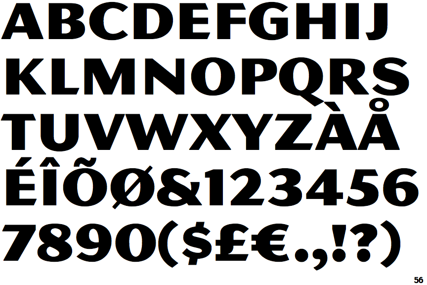
MVB Magnesium

MVB Magnesium

Open
The '&' (ampersand) is traditional style with a gap at the top.
On
The upper-case 'J' sits on the baseline.
Left
The upper-case 'G' has a bar to the left.
Same
The upper-case 'U' strokes are the same thickness.