 |
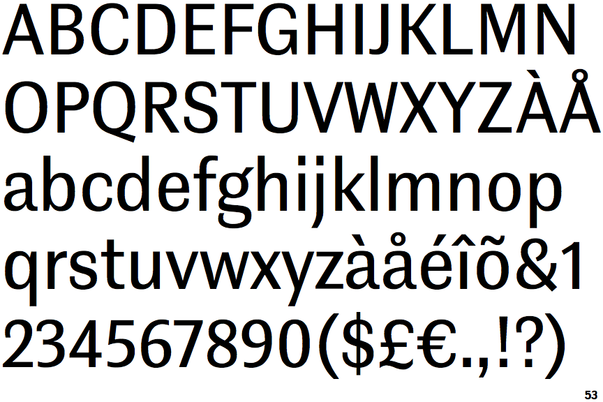
The tail of the lower-case 'y' is substantially straight.
|
 |
The lower storey of the lower-case 'g' has a gap.
|
 |
The '1' (digit one) has no base.
|
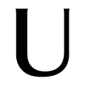 |
The upper-case 'U' left-hand stroke is visibly thicker.
|
Note that the fonts in the icons shown above represent general examples, not necessarily the two fonts chosen for comparison.
Show Examples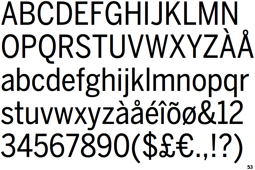
 |
The tail of the lower-case 'y' is curved or U-shaped to the left.
|
 |
The lower storey of the lower-case 'g' has no gap.
|
 |
The '1' (digit one) has double-sided base or serifs.
|
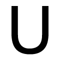 |
The upper-case 'U' strokes are the same thickness.
|