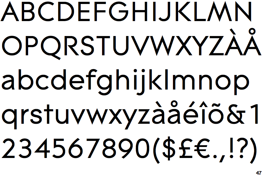
 |
The upper-case 'J' sits on the baseline.
|
 |
The verticals of the upper-case 'M' are sloping.
|
 |
The lower-case 'g' is single-storey (with or without loop).
|
 |
The upper-case 'G' has a bar to the left.
|
 |
The top of the lower-case 'q' has a vertical or slightly angled spur (pointed or flat).
|
 |
The centre bar of the upper-case 'R' leaves a gap with the vertical.
|
 |
The right side of the upper-case 'G' is curved.
|
 |
The top of the upper-case 'W' has three upper terminals.
|
 |
The tail of the lower-case 't' is straight.
|
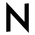 |
The upper-case 'N' vertices are pointed at the top and bottom.
|
Note that the fonts in the icons shown above represent general examples, not necessarily the two fonts chosen for comparison.
Show Examples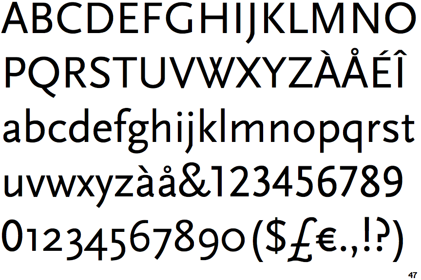
 |
The upper-case 'J' descends below the baseline.
|
 |
The verticals of the upper-case 'M' are parallel.
|
 |
The lower-case 'g' is double-storey (with or without gap).
|
 |
The upper-case 'G' has no bar.
|
 |
The top of the lower-case 'q' has no spur or serif.
|
 |
The centre bar of the upper-case 'R' meets the vertical.
|
 |
The right side of the upper-case 'G' has a flat section.
|
 |
The top of the upper-case 'W' has four upper terminals.
|
 |
The tail of the lower-case 't' is curved.
|
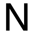 |
The upper-case 'N' vertices are flat at the top and bottom.
|