Identifont

Fonts by Appearance

Fonts by Name

Fonts by Similarity

Fonts by Picture

Fonts by Designer/Publisher

Differences

TweetTweet Differences

Compare: and  

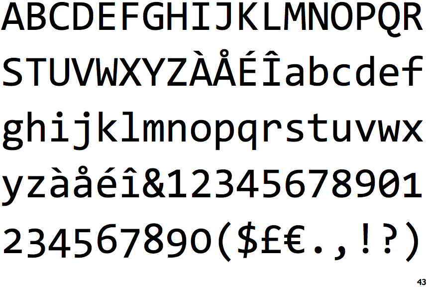
Consolas

Consolas

Sloping
The verticals of the upper-case 'M' are sloping.
2-Storey
The lower-case 'g' is double-storey (with or without gap).
No spur
The upper-case 'G' has no spur/tail.
Three
The 'l' (lower-case 'L') has a left-facing upper serif and double lower serifs.
Three
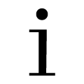
The lower-case 'i' has a left-facing upper serif and double lower serifs.

Note that the fonts in the icons shown above represent general examples, not necessarily the two fonts chosen for comparison.

Show Examples
FF Letter Gothic Mono

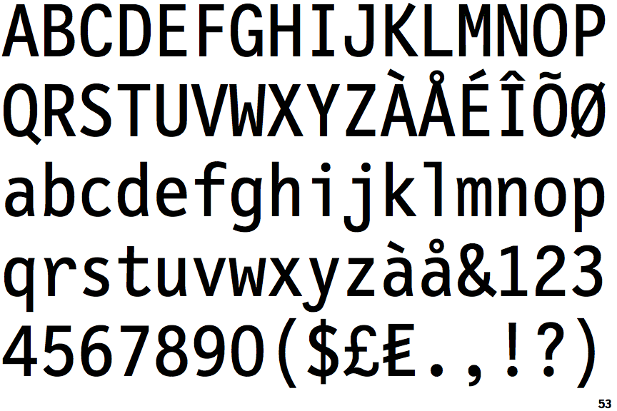
FF Letter Gothic Mono

Parallel
The verticals of the upper-case 'M' are parallel.
1-Storey
The lower-case 'g' is single-storey (with or without loop).
Spur
The upper-case 'G' has a spur/tail.
One
The 'l' (lower-case 'L') has a left-facing upper serif.
One
The lower-case 'i' has a left-facing upper serif.