Identifont

Fonts by Appearance

Fonts by Name

Fonts by Similarity

Fonts by Picture

Fonts by Designer/Publisher

Differences

TweetTweet Differences

Compare: and  

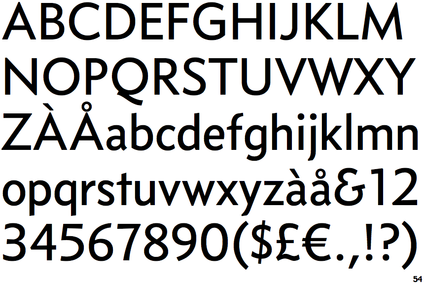
Concourse Medium

Concourse Medium

Touches
The upper-case 'Q' tail touches the circle.
Gap top
The '&' (ampersand) looks like 'Et' with a gap at the top.
Round
The top storey of the '3' is a smooth curve.
1-Storey
The lower-case 'g' is single-storey (with or without loop).
Left
The upper-case 'G' has a bar to the left.
Straight
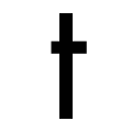
The tail of the lower-case 't' is straight.

Note that the fonts in the icons shown above represent general examples, not necessarily the two fonts chosen for comparison.

Show Examples
Relay Wide

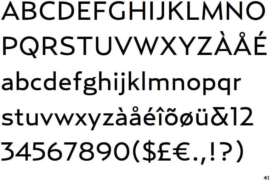
Relay Wide

Crosses
The upper-case 'Q' tail crosses the circle.
Open
The '&' (ampersand) is traditional style with a gap at the top.
Angled
The top storey of the '3' is a sharp angle.
2-Storey
The lower-case 'g' is double-storey (with or without gap).
No bar
The upper-case 'G' has no bar.
Curved
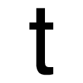
The tail of the lower-case 't' is curved.