 |
The upper-case 'J' descends below the baseline.
|
 |
The top storey of the '3' is a sharp angle.
|
 |
The top stroke of the upper-case 'C' has no upward-pointing serif.
|
 |
The tail of the upper-case 'J' has a tapered end.
|
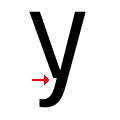 |
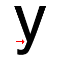
There is a break at the junction of the lower-case 'y'.
|
 |
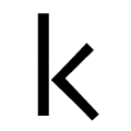
The junction of the upper-case 'K' leaves a visible gap with the vertical.
|
 |
The top stroke of the upper-case 'S' has no upward-pointing serif.
|
 |
The junction of the lower-case 'k' has a visible gap.
|
 |
The foot of the '£' (pound) has no loop.
|
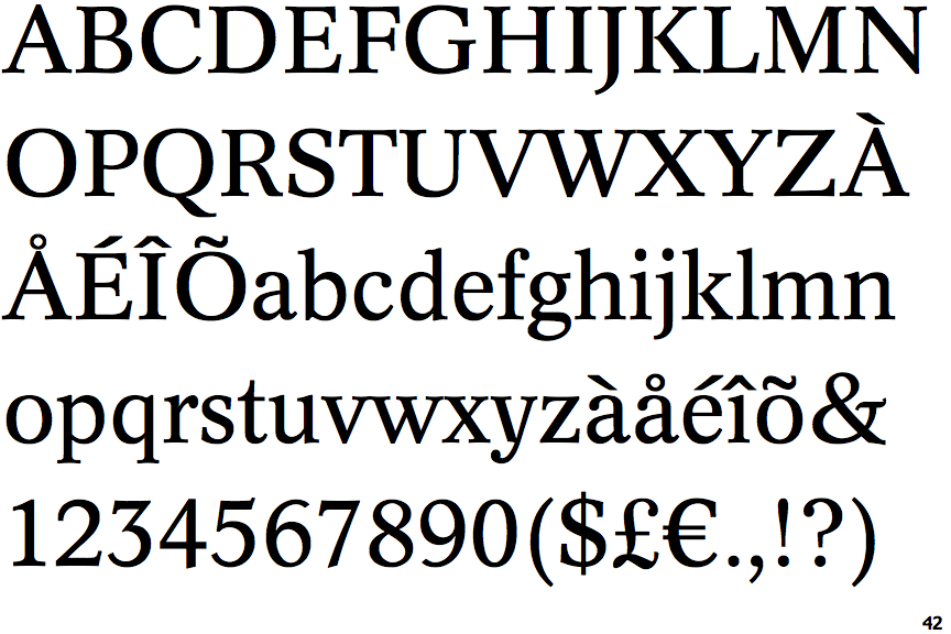
Note that the fonts in the icons shown above represent general examples, not necessarily the two fonts chosen for comparison.
Show Examples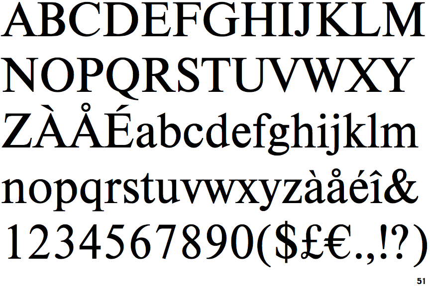
 |
The upper-case 'J' sits on the baseline.
|
 |
The top storey of the '3' is a smooth curve.
|
 |
The top stroke of the upper-case 'C' has a vertical or angled upward-pointing serif.
|
 |
The tail of the upper-case 'J' has a rounded end or ball.
|
 |
There is a smooth join at the junction of the lower-case 'y'.
|
 |
The junction of the upper-case 'K' touches the vertical.
|
 |
The top stroke of the upper-case 'S' has a vertical or angled upward-pointing serif.
|
 |
The junction of the lower-case 'k' has no gap.
|
 |
The foot of the '£' (pound) has a loop.
|