 |
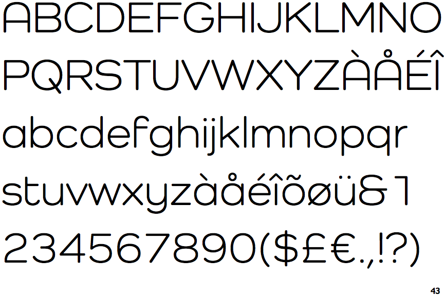
The '&' (ampersand) looks like 'Et' with one enclosed loop (with or without exit stroke).
|
 |
The diagonal strokes of the upper-case 'K' meet in a 'T'.
|
 |
The centre vertex of the upper-case 'M' is above the baseline.
|
 |
The verticals of the upper-case 'M' are parallel.
|
 |
The upper-case 'A' has parallel verticals.
|
 |
The sides of the lower-case 'y' are parallel (U-shaped).
|
 |
The tail of the lower-case 'y' is curved or U-shaped to the left.
|
 |
The bar of the lower-case 'f' is single-sided.
|
 |
The lower-case 'u' has a stem/serif.
|
 |
The tail of the lower-case 'j' is curved with no upper serif.
|
Note that the fonts in the icons shown above represent general examples, not necessarily the two fonts chosen for comparison.
Show Examples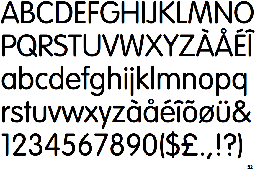
 |
The '&' (ampersand) is traditional style with two enclosed loops.
|
 |
The diagonal strokes of the upper-case 'K' meet at the vertical (with or without a gap).
|
|
The centre vertex of the upper-case 'M' is on the baseline.
|
 |
The verticals of the upper-case 'M' are sloping.
|
 |
The upper-case 'A' has tapered verticals.
|
 |
The sides of the lower-case 'y' are angled (V-shaped).
|
 |
The tail of the lower-case 'y' is substantially straight.
|
 |
The bar of the lower-case 'f' is double-sided.
|
 |
The lower-case 'u' has no stem/serif.
|
 |
The tail of the lower-case 'j' is straight with no upper serif.
|