 |
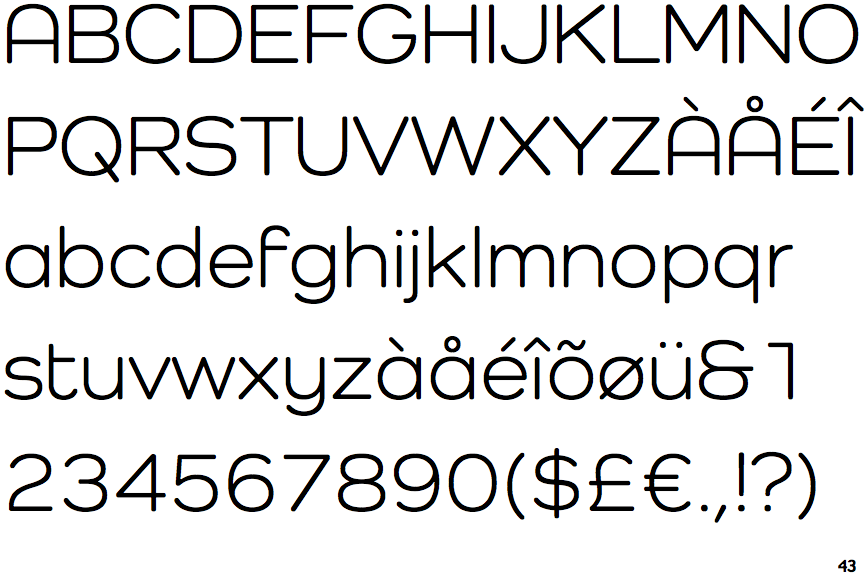
The upper-case 'Q' tail crosses the circle.
|
 |
The '&' (ampersand) looks like 'Et' with one enclosed loop (with or without exit stroke).
|
 |
The top storey of the '3' is a smooth curve.
|
 |
The upper-case 'A' has parallel verticals.
|
 |
The right side of the upper-case 'G' is curved.
|
 |
The bar of the lower-case 'f' is single-sided.
|
 |
The lower-case 'u' has a stem/serif.
|
Note that the fonts in the icons shown above represent general examples, not necessarily the two fonts chosen for comparison.
Show Examples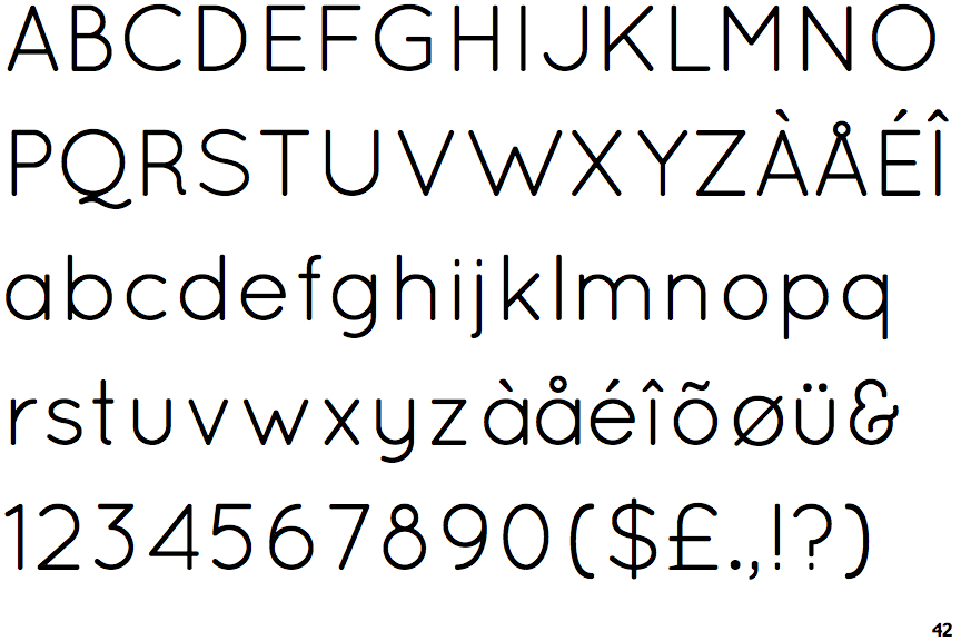
 |
The upper-case 'Q' tail touches the circle.
|
 |
The '&' (ampersand) looks like 'Et' with a gap at the top.
|
 |
The top storey of the '3' is a sharp angle.
|
 |
The upper-case 'A' has tapered verticals.
|
 |
The right side of the upper-case 'G' has a flat section.
|
 |
The bar of the lower-case 'f' is double-sided.
|
 |
The lower-case 'u' has no stem/serif.
|