Differences
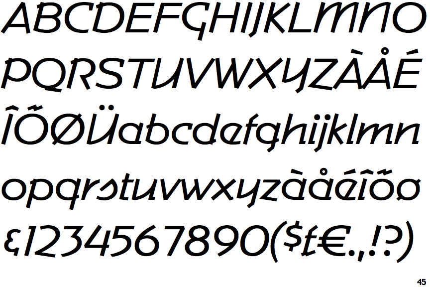
Commerce Lean
 |
The upper-case 'Q' tail touches the circle.
|
 |
The '4' is open.
|
 |
The dot on the '?' (question-mark) is circular or oval.
|
 |
The top storey of the '3' is a sharp angle.
|
 |
The centre bar of the upper-case 'P' meets the vertical.
|
 |
The upper-case 'U' has a stem/serif.
|
 |
The upper-case 'G' has a spur/tail.
|
 |
The upper-case 'Y' right-hand arm forms a continuous stroke with the tail.
|
 |
The 'l' (lower-case 'L') has a right-facing lower serif or tail.
|
 |
The centre bar of the upper-case 'R' leaves a gap with the vertical.
|
There are more than ten differences; only the first ten are shown.
Note that the fonts in the icons shown above represent general examples, not necessarily the two fonts chosen for comparison.
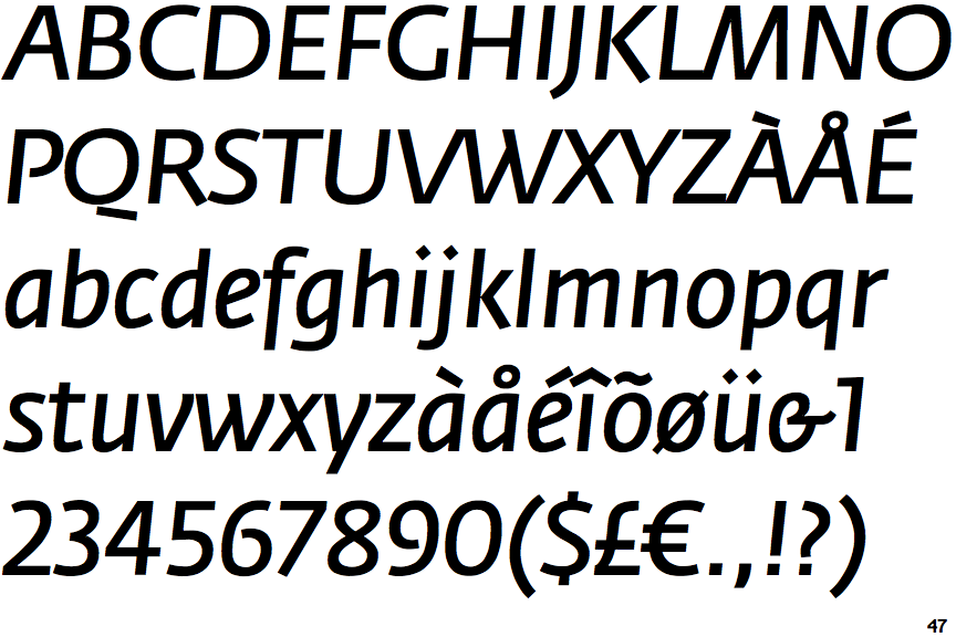
Show ExamplesFedra Sans Book Italic
 |
The upper-case 'Q' tail is below and separated from the circle.
|
 |
The '4' is closed.
|
 |
The dot on the '?' (question-mark) is square or rectangular.
|
 |
The top storey of the '3' is a smooth curve.
|
 |
The centre bar of the upper-case 'P' leaves a gap with the vertical.
|
 |
The upper-case 'U' has no stem/serif.
|
 |
The upper-case 'G' has no spur/tail.
|
 |
The upper-case 'Y' arms and tail are separate strokes.
|
 |
The 'l' (lower-case 'L') has no serifs or tail.
|
 |
The centre bar of the upper-case 'R' meets the vertical.
|

