 |
The upper-case 'Q' tail crosses the circle.
|
 |
The top storey of the '3' is a smooth curve.
|
 |
The lower-case 'g' is single-storey (with or without loop).
|
 |
The upper-case 'Y' right-hand arm forms a continuous stroke with the tail.
|
 |
The top of the upper-case 'A' has no serifs or cusps.
|
 |
The top stroke of the upper-case 'C' has no upward-pointing serif.
|
 |
The centre bar of the upper-case 'E' has no serifs.
|
 |
The centre bar of the upper-case 'R' leaves a gap with the vertical.
|
 |
The lower-case 'e' has a curved bar with no straight segment.
|
 |
The centre bar of the upper-case 'F' has no serifs.
|
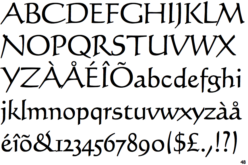
Note that the fonts in the icons shown above represent general examples, not necessarily the two fonts chosen for comparison.
Show Examples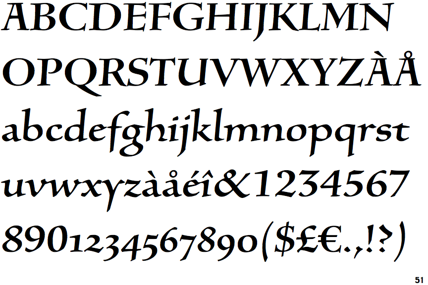
 |
The upper-case 'Q' tail touches the circle.
|
 |
The top storey of the '3' is a sharp angle.
|
 |
The lower-case 'g' is double-storey (with or without gap).
|
 |
The upper-case 'Y' arms and tail are separate strokes.
|
 |
The top of the upper-case 'A' has serifs both sides, or a top bar.
|
 |
The top stroke of the upper-case 'C' has a vertical or angled upward-pointing serif.
|
 |
The centre bar of the upper-case 'E' has serifs.
|
 |
The centre bar of the upper-case 'R' meets the vertical.
|
 |
The lower-case 'e' has a straight angled bar.
|
 |
The centre bar of the upper-case 'F' has serifs.
|