 |
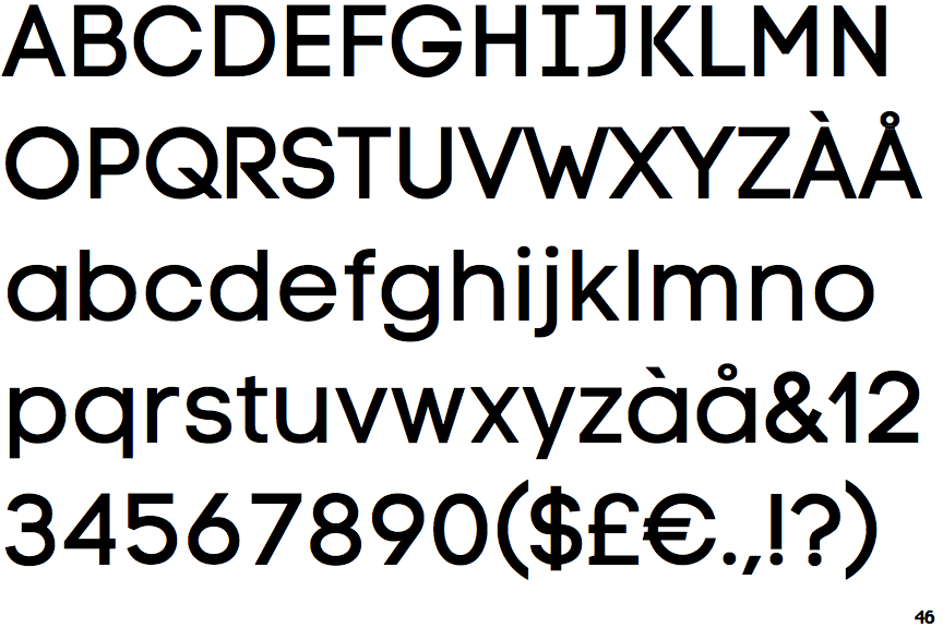
The centre vertex of the upper-case 'M' is above the baseline.
|
 |
The verticals of the upper-case 'M' are parallel.
|
 |
The upper-case 'J' has a bar to the left.
|
 |
The centre bar of the upper-case 'R' leaves a gap with the vertical.
|
 |
The lower-case 'u' has a stem/serif.
|
 |
The upper-case letter 'I' has serifs/bars.
|
 |
The diagonal strokes of the lower-case 'k' meet in a 'T'.
|
 |
The foot of the '£' (pound) has no loop.
|
Note that the fonts in the icons shown above represent general examples, not necessarily the two fonts chosen for comparison.
Show Examples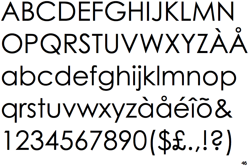
|
The centre vertex of the upper-case 'M' is on the baseline.
|
 |
The verticals of the upper-case 'M' are sloping.
|
 |
The upper-case 'J' has no bar.
|
 |
The centre bar of the upper-case 'R' meets the vertical.
|
 |
The lower-case 'u' has no stem/serif.
|
 |
The upper-case letter 'I' is plain.
|
 |
The diagonal strokes of the lower-case 'k' meet at the vertical (with or without a gap).
|
 |
The foot of the '£' (pound) has a loop.
|