 |
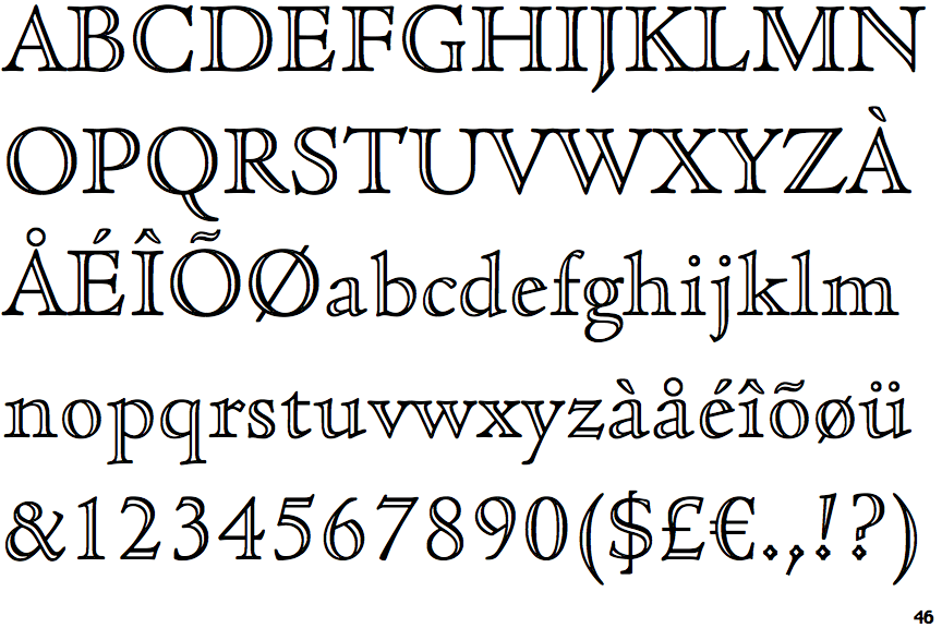
The upper-case 'Q' tail touches the circle.
|
 |
The '&' (ampersand) is traditional style with two enclosed loops.
|
 |
The upper-case 'J' descends below the baseline.
|
 |
The centre vertex of the upper-case 'M' is on the baseline.
|
 |
The dot on the '?' (question-mark) is diamond-shaped or triangular.
|
|
The verticals of the upper-case 'M' are parallel.
|
 |
The top of the upper-case 'A' has no serifs or cusps.
|
 |
The centre vertex of the upper-case 'W' has two separate serifs.
|
 |
The lower storey of the lower-case 'g' has no gap.
|
 |
The characters are outlined with thick and thin lines to give a 3D appearance (open face, engraved, or handtooled).
|
There are more than ten differences; only the first ten are shown.
Note that the fonts in the icons shown above represent general examples, not necessarily the two fonts chosen for comparison.
Show Examples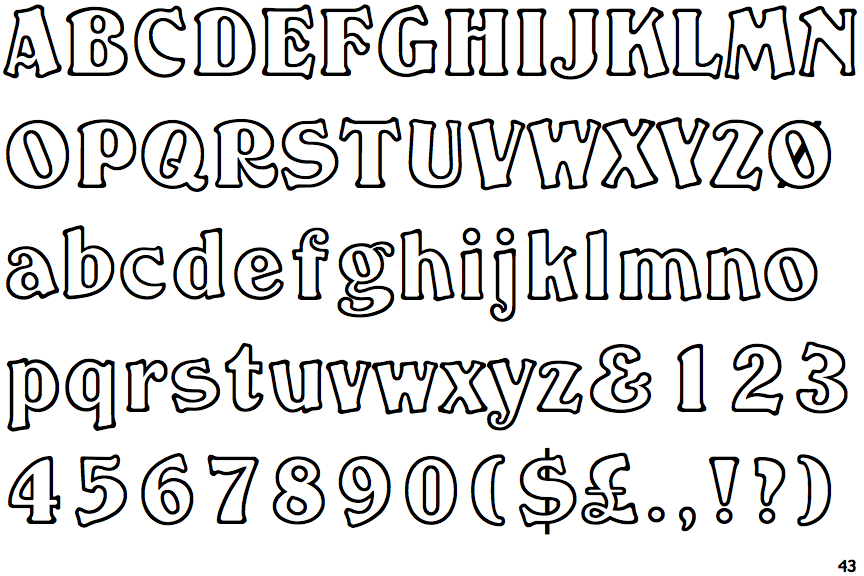
 |
The upper-case 'Q' tail crosses the circle.
|
 |
The '&' (ampersand) looks like 'Et' with a gap at the top.
|
 |
The upper-case 'J' sits on the baseline.
|
 |
The centre vertex of the upper-case 'M' is above the baseline.
|
 |
The dot on the '?' (question-mark) is circular or oval.
|
 |
The verticals of the upper-case 'M' are sloping.
|
 |
The top of the upper-case 'A' has serifs both sides, or a top bar.
|
 |
The centre vertex of the upper-case 'W' has no serifs.
|
 |
The lower storey of the lower-case 'g' has a gap.
|
 |
The characters are outlined.
|