 |
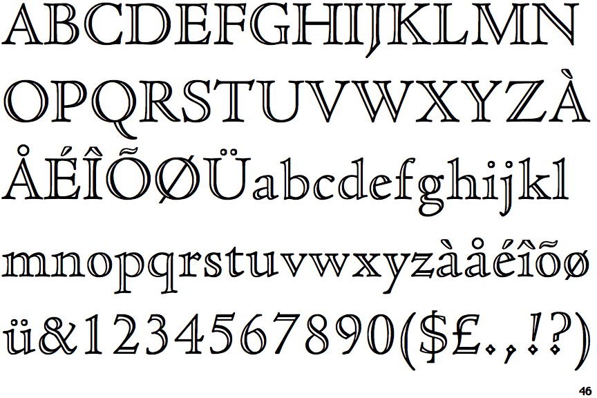
The diagonal strokes of the upper-case 'K' meet in a 'T'.
|
 |
The dot on the '?' (question-mark) is diamond-shaped or triangular.
|
 |
The top of the upper-case 'A' has no serifs or cusps.
|
 |
The top stroke of the upper-case 'C' has a vertical or angled upward-pointing serif.
|
 |
The bar of the upper-case 'G' is double-sided.
|
 |
The feet of the lower-case 'h' have two serifs on each foot.
|
 |
The lower storey of the lower-case 'g' has no gap.
|
 |
The top vertices of the upper-case 'M' have symmetrical double-sided serifs.
|
 |
The characters are outlined with thick and thin lines to give a 3D appearance (open face, engraved, or handtooled).
|
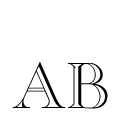
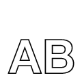
Note that the fonts in the icons shown above represent general examples, not necessarily the two fonts chosen for comparison.
Show Examples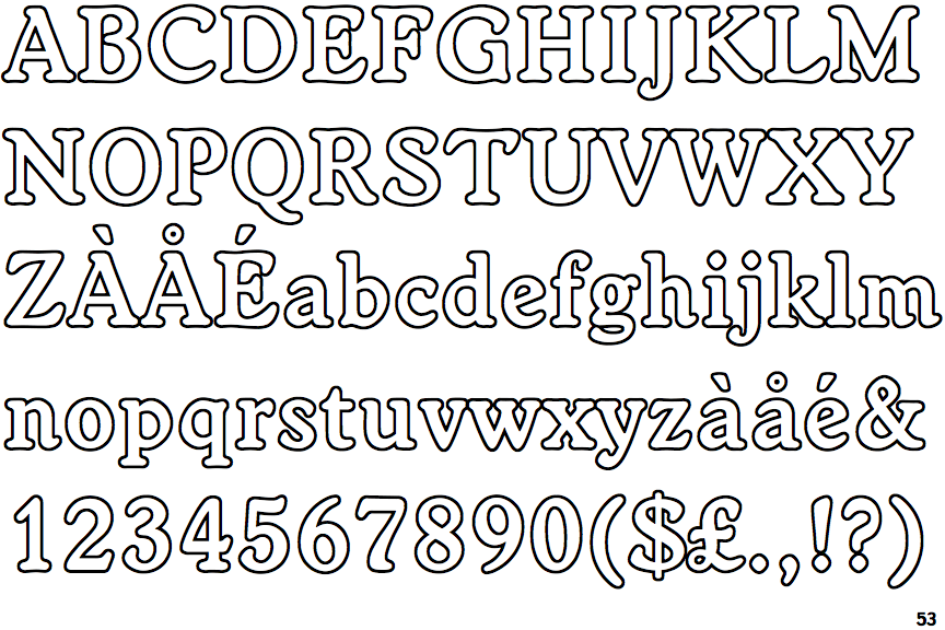
 |
The diagonal strokes of the upper-case 'K' meet at the vertical (with or without a gap).
|
 |
The dot on the '?' (question-mark) is circular or oval.
|
 |
The top of the upper-case 'A' has a serif or cusp on the left.
|
 |
The top stroke of the upper-case 'C' has no upward-pointing serif.
|
 |
The bar of the upper-case 'G' is single-sided, left-facing.
|
 |
The feet of the lower-case 'h' have two serifs on the left and one on the right.
|
 |
The lower storey of the lower-case 'g' has a gap.
|
 |
The top vertices of the upper-case 'M' have symmetrical single-sided serifs.
|
 |
The characters are outlined.
|