 |
The upper-case 'Q' tail touches the circle.
|
 |
The upper-case 'J' descends below the baseline.
|
 |
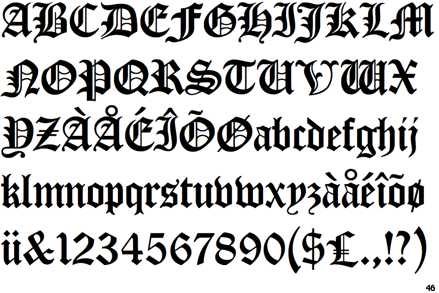
The dot on the lower-case 'i' or 'j' is triangular.
|
 |
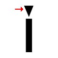
The tail of the lower-case 'y' is curved or U-shaped to the right.
|
 |
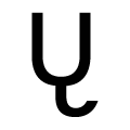
The lower-case 'z' is double-storey.
|
 |
The strokes of the upper-case 'W' are like two opening brackets and a vertical bar '((|'.
|
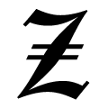 |
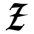
The upper-case 'Z' has double bar.
|
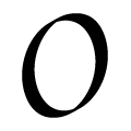 |
The upper-case letter 'O' has a smooth outline with no discontinuity or gap.
|
Note that the fonts in the icons shown above represent general examples, not necessarily the two fonts chosen for comparison.
Show Examples
 |
The upper-case 'Q' tail crosses the circle.
|
 |
The upper-case 'J' sits on the baseline.
|
 |
The dot on the lower-case 'i' or 'j' is diamond-shaped.
|
 |
The tail of the lower-case 'y' is curved or U-shaped to the left.
|
 |
The lower-case 'z' is single-storey with a bar.
|
 |
The strokes of the upper-case 'W' are like three vertical bars '|||'.
|
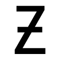 |
The upper-case 'Z' has a single bar.
|
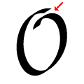 |
The upper-case letter 'O' has a discontinuity or gap.
|