Identifont

Fonts by Appearance

Fonts by Name

Fonts by Similarity

Fonts by Picture

Fonts by Designer/Publisher

Differences

TweetTweet Differences

Compare: and  

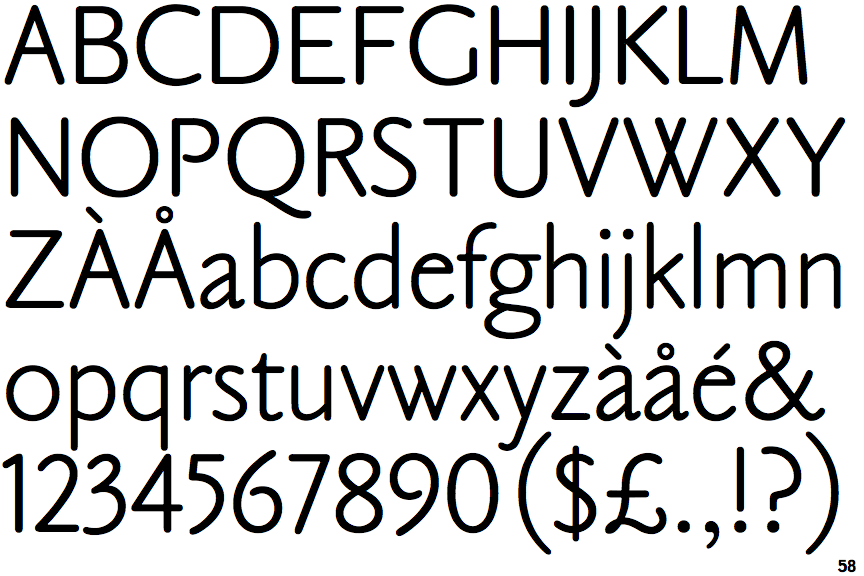
Claude Sans

Claude Sans

Below
The upper-case 'J' descends below the baseline.
Sans-serif
The characters do not have serifs.
Gap
The centre bar of the upper-case 'P' leaves a gap with the vertical.
2-Storey
The lower-case 'g' is double-storey (with or without gap).

Note that the fonts in the icons shown above represent general examples, not necessarily the two fonts chosen for comparison.

Show Examples
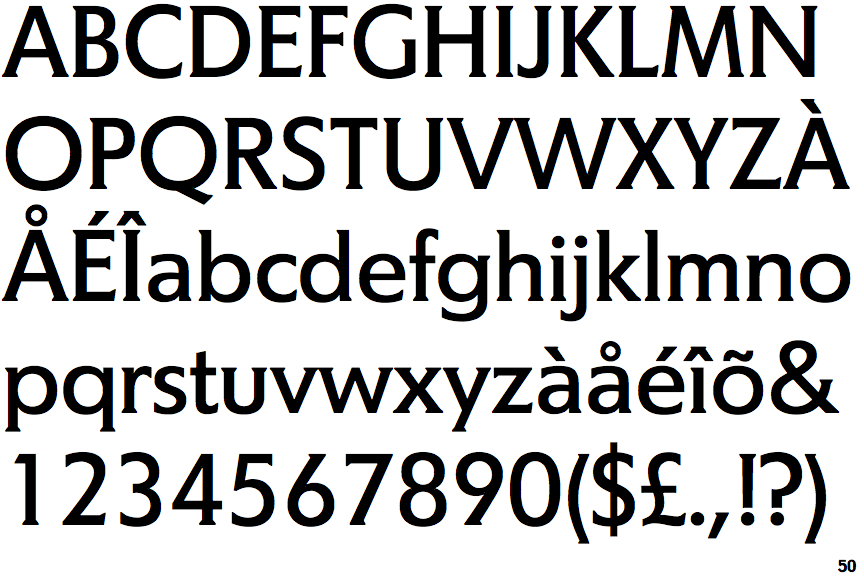
Agora

Agora

On
The upper-case 'J' sits on the baseline.
Serif
The characters have serifs.
Meets
The centre bar of the upper-case 'P' meets the vertical.
1-Storey
The lower-case 'g' is single-storey (with or without loop).