Identifont

Fonts by Appearance

Fonts by Name

Fonts by Similarity

Fonts by Picture

Fonts by Designer/Publisher

Differences

TweetTweet Differences

Compare: and  

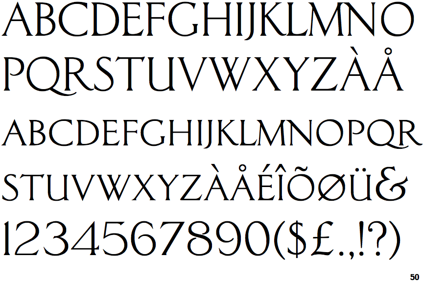
Classic Roman

Classic Roman

Gap top
The '&' (ampersand) looks like 'Et' with a gap at the top.
Serif
The characters have serifs.
Gap
The centre bar of the upper-case 'P' leaves a gap with the vertical.
Stem
The upper-case 'U' has a stem/serif.

Note that the fonts in the icons shown above represent general examples, not necessarily the two fonts chosen for comparison.

Show Examples
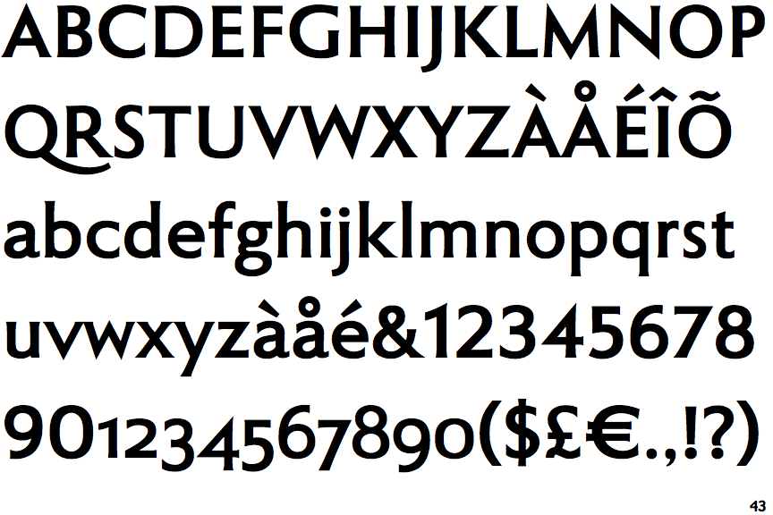
Roma Bold

Roma Bold

Closed
The '&' (ampersand) is traditional style with two enclosed loops.
Sans-serif
The characters do not have serifs.
Meets
The centre bar of the upper-case 'P' meets the vertical.
No-Stem
The upper-case 'U' has no stem/serif.