Differences
Classic
 |
The upper-case 'J' sits on the baseline.
|
 |
The diagonal strokes of the upper-case 'K' meet at the vertical (with or without a gap).
|
 |
The centre vertex of the upper-case 'M' is above the baseline.
|
 |
The verticals of the upper-case 'M' are sloping.
|
 |
The upper-case 'U' has no stem/serif.
|
 |
The lower-case 'a' stem stops at the top of the bowl (single storey).
|
 |
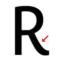
The leg of the upper-case 'R' is curved outwards.
|
 |
The upper-case 'A' has parallel verticals.
|
 |
The sides of the lower-case 'y' are angled (V-shaped).
|
 |
The lower-case 'e' has a straight angled bar.
|
There are more than ten differences; only the first ten are shown.
Note that the fonts in the icons shown above represent general examples, not necessarily the two fonts chosen for comparison.
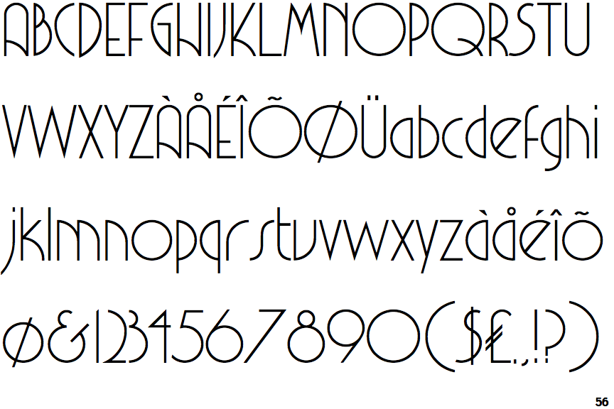
Show ExamplesP22 Art Deco Chic
 |
The upper-case 'J' descends below the baseline.
|
 |
The diagonal strokes of the upper-case 'K' meet in a 'T'.
|
 |
The centre vertex of the upper-case 'M' is on the baseline.
|
 |
The verticals of the upper-case 'M' are parallel.
|
 |
The upper-case 'U' has a stem/serif.
|
 |
The lower-case 'a' stem curves over the top of the bowl (double storey).
|
 |
The leg of the upper-case 'R' is curved inwards.
|
 |
The upper-case 'A' has tapered verticals.
|
 |
The sides of the lower-case 'y' are parallel (U-shaped).
|
 |
The lower-case 'e' has a straight horizontal bar.
|

