 |
The upper-case 'Q' tail forms part of the stroke of an open circle.
|
 |
The dot on the '?' (question-mark) is diamond-shaped or triangular.
|
 |
The top storey of the '3' is a smooth curve.
|
 |
The centre bar of the upper-case 'P' leaves a gap with the vertical.
|
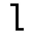 |
The 'l' (lower-case 'L') has a left-facing upper serif and right-facing lower serif or tail.
|
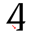 |
The foot of the '4' has a single left-facing serif.
|
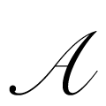 |
The upper-case 'A' bar is drawn as a separate stroke and no flourish on top.
|
 |
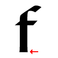
The tail of the lower-case 'f' descends below the baseline.
|
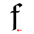 |
The tail of the lower-case 'f' is angled.
|
 |
The centre strokes of the upper-case 'W' meet in a T on the left.
|
There are more than ten differences; only the first ten are shown.
Note that the fonts in the icons shown above represent general examples, not necessarily the two fonts chosen for comparison.
Show Examples
 |
The upper-case 'Q' tail touches the circle.
|
 |
The dot on the '?' (question-mark) is circular or oval.
|
 |
The top storey of the '3' is a sharp angle.
|
 |
The centre bar of the upper-case 'P' meets the vertical.
|
 |
The 'l' (lower-case 'L') has a right-facing lower serif or tail.
|
 |
The foot of the '4' has no serifs.
|
 |
The upper-case 'A' bar is drawn as a separate stroke and flourish on top.
|
 |
The tail of the lower-case 'f' sits on the baseline.
|
 |
The tail of the lower-case 'f' is horizontally flat.
|
 |
The centre strokes of the upper-case 'W' form one centre stroke.
|