Identifont

Fonts by Appearance

Fonts by Name

Fonts by Similarity

Fonts by Picture

Fonts by Designer/Publisher

Differences

TweetTweet Differences

Compare: and  

Christiana

Christiana

On
The upper-case 'J' sits on the baseline.
Double
The diagonal strokes of the upper-case 'K' meet in a 'T'.
Angled
The top storey of the '3' is a sharp angle.
Stem
The upper-case 'U' has a stem/serif.
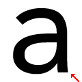
Straight
The stem of the lower-case 'a' is straight.

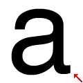
Note that the fonts in the icons shown above represent general examples, not necessarily the two fonts chosen for comparison.

Show Examples
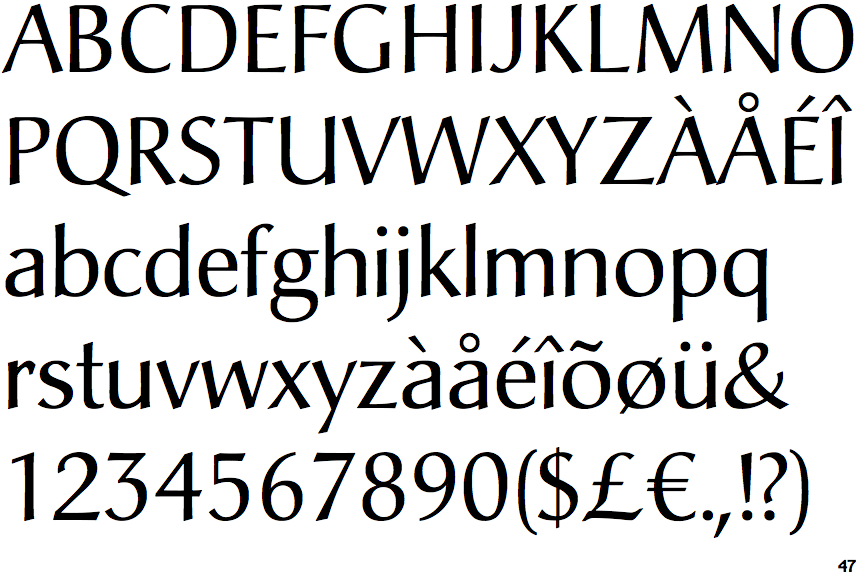
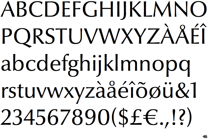
Optima Nova

Optima Nova

Below
The upper-case 'J' descends below the baseline.
Single
The diagonal strokes of the upper-case 'K' meet at the vertical (with or without a gap).
Round
The top storey of the '3' is a smooth curve.
No-Stem
The upper-case 'U' has no stem/serif.
Curved
The stem of the lower-case 'a' is curved.