 |
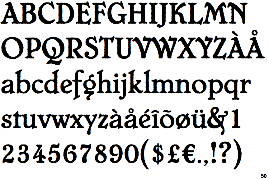
The upper-case 'Q' tail crosses the circle.
|
 |
The '&' (ampersand) is traditional style with two enclosed loops.
|
 |
The characters have serifs.
|
 |
The '4' is open.
|
 |
The centre vertex of the upper-case 'M' is above the baseline.
|
 |
The dot on the '?' (question-mark) is circular or oval.
|
 |
The verticals of the upper-case 'M' are sloping.
|
 |
The dot on the lower-case 'i' or 'j' is circular or oval.
|
 |
The lower storey of the lower-case 'g' has a gap.
|
 |
The character outlines are corroded, roughened, or dirty.
|
There are more than ten differences; only the first ten are shown.
Note that the fonts in the icons shown above represent general examples, not necessarily the two fonts chosen for comparison.
Show Examples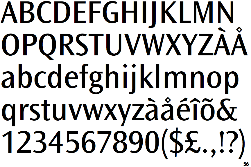
 |
The upper-case 'Q' tail touches the circle.
|
 |
The '&' (ampersand) is traditional style with a gap at the top.
|
 |
The characters do not have serifs.
|
 |
The '4' is closed.
|
 |
The centre vertex of the upper-case 'M' is on the baseline.
|
 |
The dot on the '?' (question-mark) is diamond-shaped or triangular.
|
|
The verticals of the upper-case 'M' are parallel.
|
 |
The dot on the lower-case 'i' or 'j' is diamond-shaped.
|
 |
The lower storey of the lower-case 'g' has no gap.
|
 |
The character outlines are smooth/sharp.
|