 |
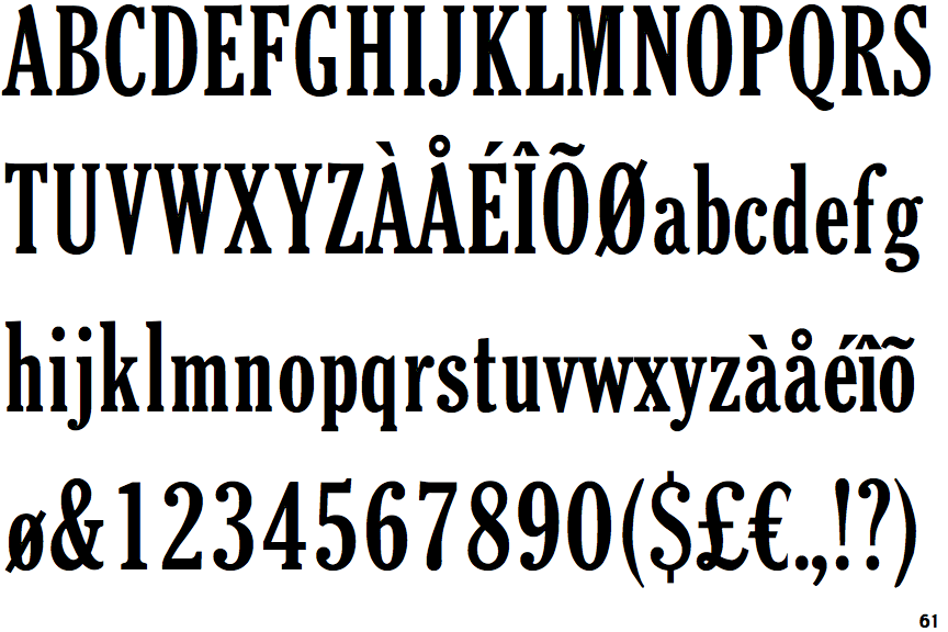
The '&' (ampersand) is traditional style with two enclosed loops.
|
 |
The upper-case 'J' sits on the baseline.
|
 |
The '4' is closed.
|
 |
The centre bar of the upper-case 'P' meets the vertical.
|
 |
The top stroke of the upper-case 'C' has a vertical or angled upward-pointing serif.
|
 |
The upper-case 'G' foot has a forward pointing spur or serif.
|
 |
The centre bar of the upper-case 'R' meets the vertical.
|
 |
The bar of the upper-case 'G' is single-sided, left-facing.
|
 |
The lower-case 'e' has a straight horizontal bar.
|
 |
The lower storey of the lower-case 'g' has a gap.
|
Note that the fonts in the icons shown above represent general examples, not necessarily the two fonts chosen for comparison.
Show Examples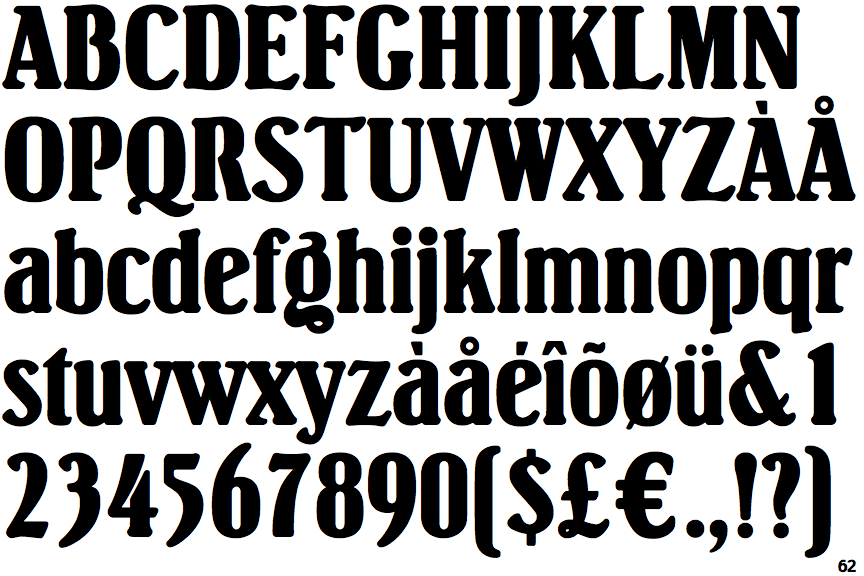
 |
The '&' (ampersand) is traditional style with a gap at the top.
|
 |
The upper-case 'J' descends below the baseline.
|
 |
The '4' is open.
|
 |
The centre bar of the upper-case 'P' leaves a gap with the vertical.
|
 |
The top stroke of the upper-case 'C' has no upward-pointing serif.
|
 |
The upper-case 'G' foot has no spur or serif.
|
 |
The centre bar of the upper-case 'R' leaves a gap with the vertical.
|
 |
The bar of the upper-case 'G' is double-sided.
|
 |
The lower-case 'e' has a straight angled bar.
|
 |
The lower storey of the lower-case 'g' has no gap.
|