Identifont

Fonts by Appearance

Fonts by Name

Fonts by Similarity

Fonts by Picture

Fonts by Designer/Publisher

Differences

TweetTweet Differences

Compare: and  

Chelsea Samuels

Chelsea Samuels

Gap top
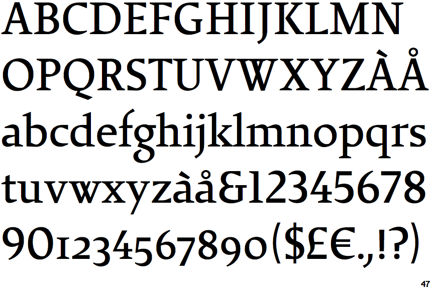
The '&' (ampersand) looks like 'Et' with a gap at the top.
Below
The upper-case 'J' descends below the baseline.
Open
The '4' is open.
Four
The top of the upper-case 'W' has four upper terminals.
Gap
The lower storey of the lower-case 'g' has a gap.

Note that the fonts in the icons shown above represent general examples, not necessarily the two fonts chosen for comparison.

Show Examples
Calisto

Calisto

Closed
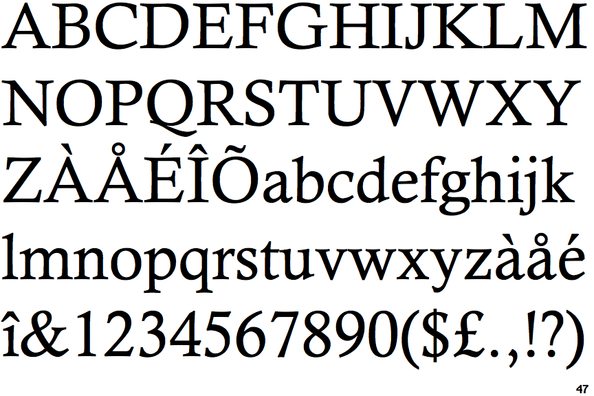
The '&' (ampersand) is traditional style with two enclosed loops.
On
The upper-case 'J' sits on the baseline.
Closed
The '4' is closed.
Three
The top of the upper-case 'W' has three upper terminals.
No gap
The lower storey of the lower-case 'g' has no gap.