Differences
Chelsea Samuels
 |
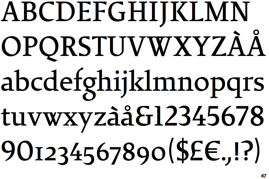
The '&' (ampersand) looks like 'Et' with a gap at the top.
|
 |
The '4' is open.
|
 |
The centre bar of the upper-case 'E' has serifs.
|
 |
The top of the upper-case 'W' has four upper terminals.
|
 |
The bar of the upper-case 'G' is double-sided.
|
 |
The lower storey of the lower-case 'g' has a gap.
|
 |
The centre bar of the upper-case 'F' has serifs.
|
Note that the fonts in the icons shown above represent general examples, not necessarily the two fonts chosen for comparison.
Show ExamplesAndulka Text
 |
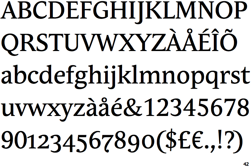
The '&' (ampersand) is traditional style with two enclosed loops.
|
 |
The '4' is closed.
|
 |
The centre bar of the upper-case 'E' has no serifs.
|
 |
The top of the upper-case 'W' has three upper terminals.
|
 |
The bar of the upper-case 'G' is single-sided, left-facing.
|
 |
The lower storey of the lower-case 'g' has no gap.
|
 |
The centre bar of the upper-case 'F' has no serifs.
|

