 |
The diagonal strokes of the upper-case 'K' meet in a 'T'.
|
 |
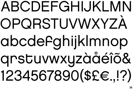
The dot on the '?' (question-mark) is square or rectangular.
|
 |
The verticals of the upper-case 'M' are parallel.
|
 |
The upper-case 'G' has a spur/tail.
|
 |
The leg of the upper-case 'R' is curved outwards.
|
 |
The dot on the lower-case 'i' or 'j' is square or rectangular.
|
 |
The sides of the lower-case 'y' are parallel (U-shaped).
|
 |
The bar of the lower-case 'f' is single-sided.
|
 |
The lower-case 'u' has a stem/serif.
|
 |
The diagonal strokes of the lower-case 'k' meet in a 'T'.
|
There are more than ten differences; only the first ten are shown.
Note that the fonts in the icons shown above represent general examples, not necessarily the two fonts chosen for comparison.
Show Examples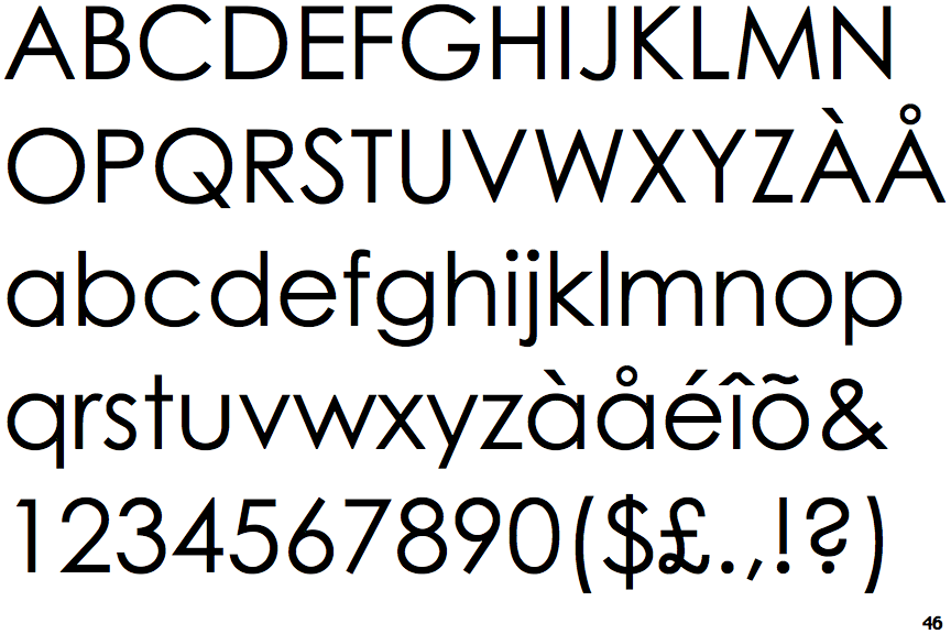
 |
The diagonal strokes of the upper-case 'K' meet at the vertical (with or without a gap).
|
 |
The dot on the '?' (question-mark) is circular or oval.
|
 |
The verticals of the upper-case 'M' are sloping.
|
 |
The upper-case 'G' has no spur/tail.
|
 |
The leg of the upper-case 'R' is straight.
|
 |
The dot on the lower-case 'i' or 'j' is circular or oval.
|
 |
The sides of the lower-case 'y' are angled (V-shaped).
|
 |
The bar of the lower-case 'f' is double-sided.
|
 |
The lower-case 'u' has no stem/serif.
|
 |
The diagonal strokes of the lower-case 'k' meet at the vertical (with or without a gap).
|