Identifont

Fonts by Appearance

Fonts by Name

Fonts by Similarity

Fonts by Picture

Fonts by Designer/Publisher

Differences

TweetTweet Differences

Compare: and  

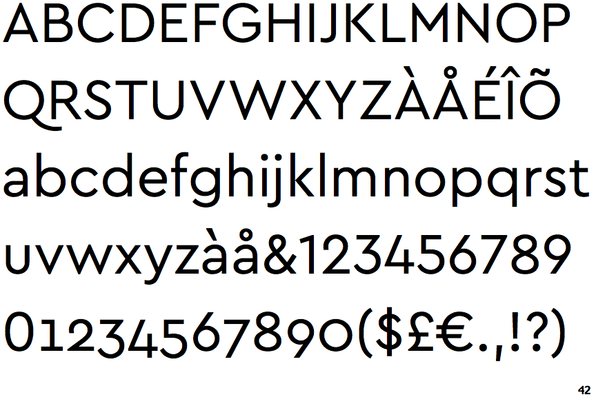
Cera

Cera

Open
The '4' is open.
Above
The centre vertex of the upper-case 'M' is above the baseline.
Angled
The top storey of the '3' is a sharp angle.
No-Stem
The lower-case 'u' has no stem/serif.

Note that the fonts in the icons shown above represent general examples, not necessarily the two fonts chosen for comparison.

Show Examples
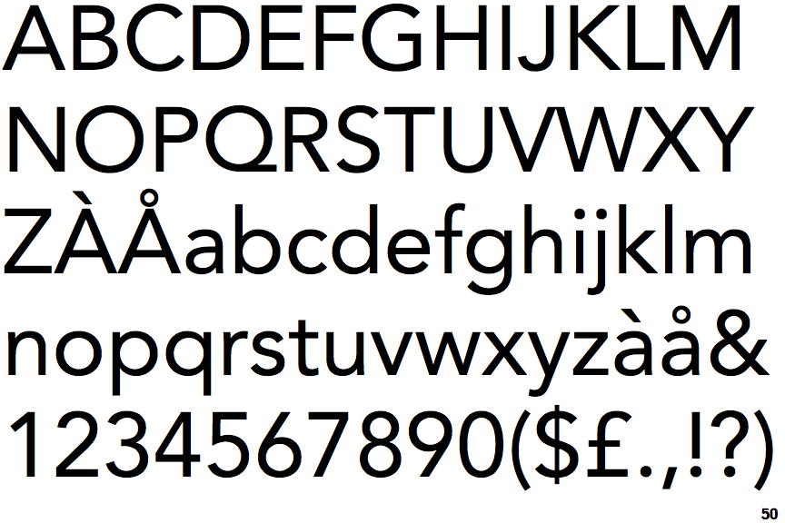
Avenir

Avenir

Closed
The '4' is closed.
Baseline
The centre vertex of the upper-case 'M' is on the baseline.
Round
The top storey of the '3' is a smooth curve.
Stem
The lower-case 'u' has a stem/serif.