 |
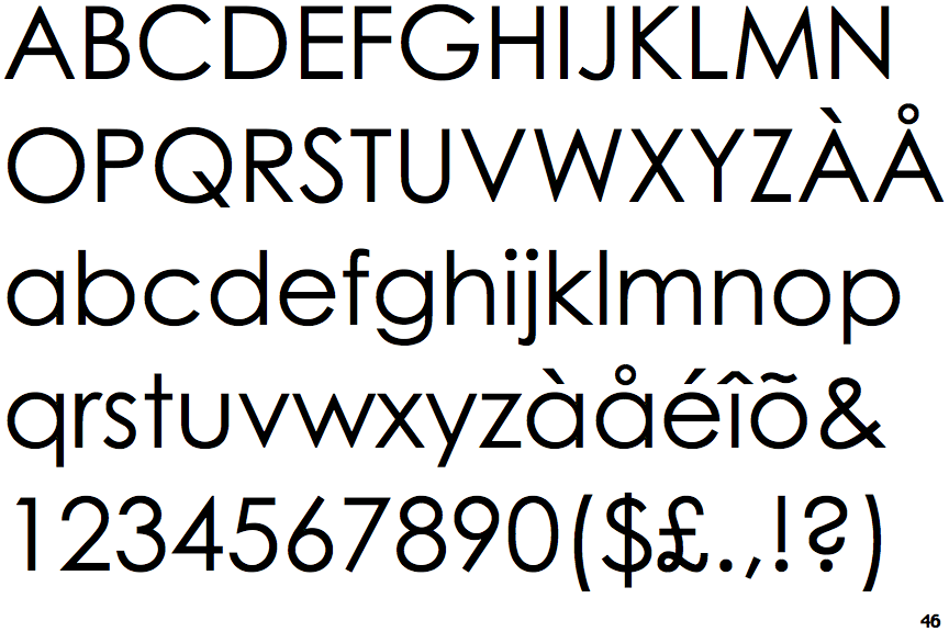
The characters do not have serifs.
|
 |
The diagonal strokes of the upper-case 'K' meet at the vertical (with or without a gap).
|
 |
The verticals of the upper-case 'M' are sloping.
|
 |
The lower-case 'g' is single-storey (with or without loop).
|
 |
The strokes are upright.
|
 |
The tail of the upper-case 'Q' is straight.
|
 |
The diagonal strokes of the lower-case 'k' meet at the vertical (with or without a gap).
|
 |
The tail of the lower-case 'f' sits on the baseline.
|
Note that the fonts in the icons shown above represent general examples, not necessarily the two fonts chosen for comparison.
Show Examples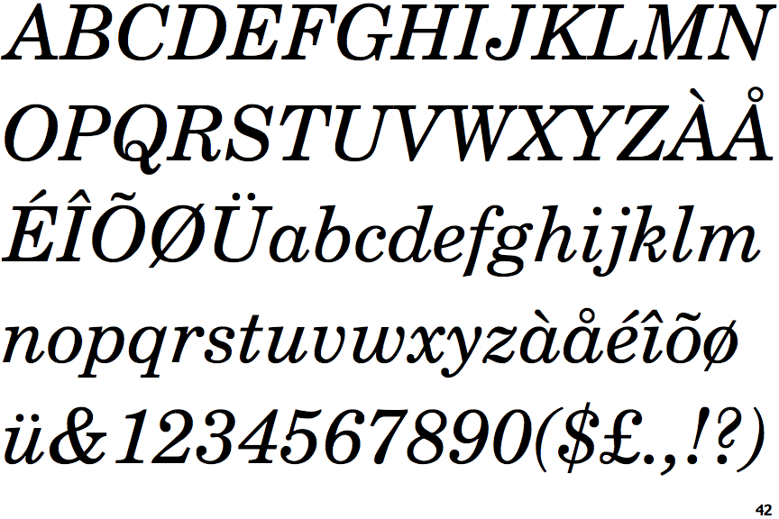
 |
The characters have serifs.
|
 |
The diagonal strokes of the upper-case 'K' meet in a 'T'.
|
 |
The verticals of the upper-case 'M' are parallel.
|
 |
The lower-case 'g' is double-storey (with or without gap).
|
 |
The strokes are sloped right (italic, oblique, or cursive).
|
 |
The tail of the upper-case 'Q' is curved or S-shaped.
|
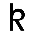 |
The diagonal strokes of the lower-case 'k' form a loop.
|
 |
The tail of the lower-case 'f' descends below the baseline.
|