 |
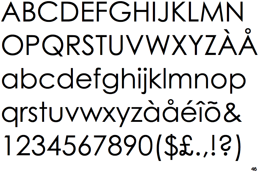
The tail of the lower-case 'j' is curved with no upper serif.
|
 |
The junction of the lower-case 'k' has no gap.
|
 |
The foot of the '£' (pound) has a loop.
|
Note that the fonts in the icons shown above represent general examples, not necessarily the two fonts chosen for comparison.
Show Examples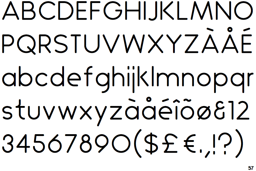
 |
The tail of the lower-case 'j' is straight with no upper serif.
|
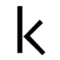 |
The junction of the lower-case 'k' has a visible gap.
|
 |
The foot of the '£' (pound) has no loop.
|