 |
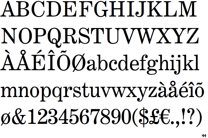
The centre vertex of the upper-case 'M' is on the baseline.
|
 |
The centre vertex of the upper-case 'W' has two separate serifs.
|
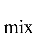 |
The character widths are variable (proportional).
|
 |
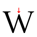
The centre vertex of the upper-case 'W' is level with the outer strokes.
|
Note that the fonts in the icons shown above represent general examples, not necessarily the two fonts chosen for comparison.
Show Examples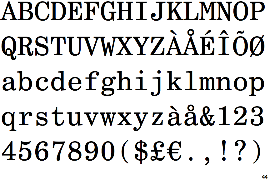
 |
The centre vertex of the upper-case 'M' is above the baseline.
|
 |
The centre vertex of the upper-case 'W' has no serifs.
|
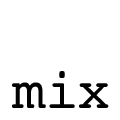 |
The character widths are fixed (monospaced).
|
 |
The centre vertex of the upper-case 'W' is below the outer strokes.
|