Identifont

Fonts by Appearance

Fonts by Name

Fonts by Similarity

Fonts by Picture

Fonts by Designer/Publisher

Differences

TweetTweet Differences

Compare: and  

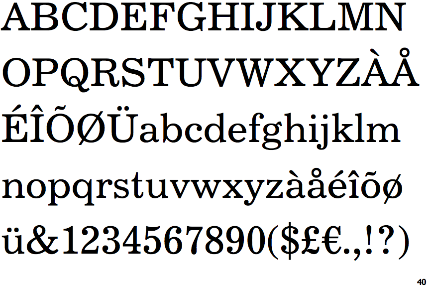
Century 731

Century 731

2-Storey
The lower-case 'g' is double-storey (with or without gap).
Top serif
The top stroke of the upper-case 'C' has a vertical or angled upward-pointing serif.
Spur
The upper-case 'G' foot has a downward pointing spur.

Note that the fonts in the icons shown above represent general examples, not necessarily the two fonts chosen for comparison.

Show Examples
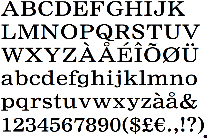
Nimrod Small Ads

Nimrod Small Ads

1-Storey
The lower-case 'g' is single-storey (with or without loop).
No top serif
The top stroke of the upper-case 'C' has no upward-pointing serif.
No-Spur
The upper-case 'G' foot has no spur or serif.