 |
The diagonal strokes of the upper-case 'K' meet in a 'T'.
|
 |
The dot on the '?' (question-mark) is circular or oval.
|
 |
The upper-case 'U' has no stem/serif.
|
 |
The centre bar of the upper-case 'E' has serifs.
|
 |
The dot on the lower-case 'i' or 'j' is circular or oval.
|
 |
The centre bar of the upper-case 'F' has serifs.
|
 |
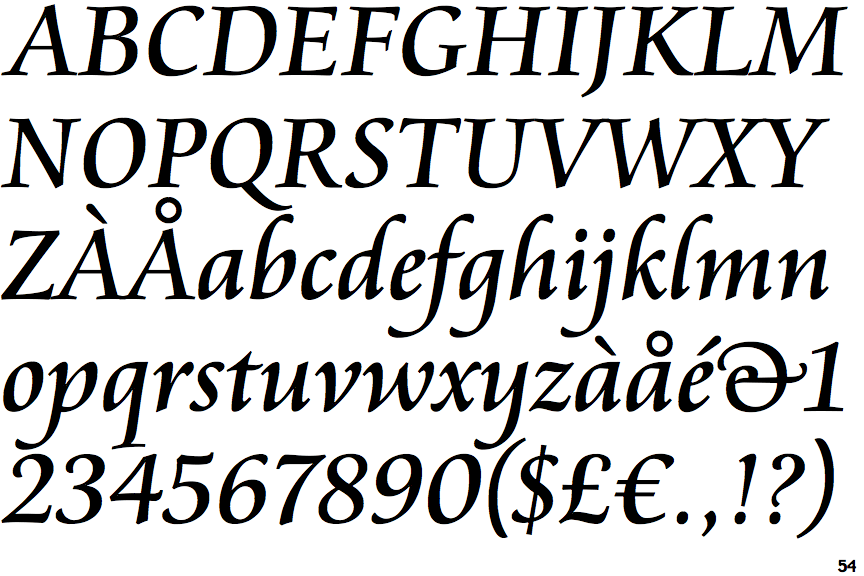
The upper-case 'A' bar is drawn as a separate stroke and no flourish on top.
|
Note that the fonts in the icons shown above represent general examples, not necessarily the two fonts chosen for comparison.
Show Examples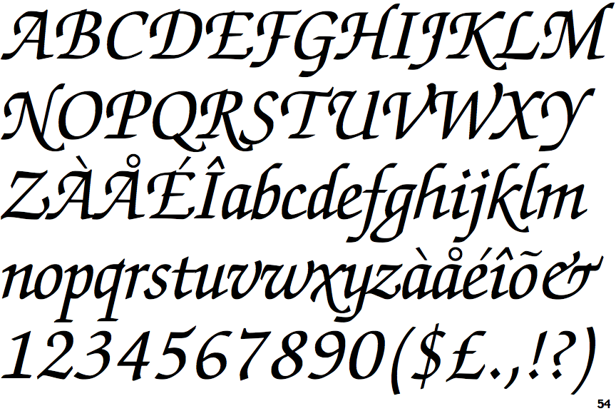
 |
The diagonal strokes of the upper-case 'K' meet at the vertical (with or without a gap).
|
 |
The dot on the '?' (question-mark) is diamond-shaped or triangular.
|
 |
The upper-case 'U' has a stem/serif.
|
 |
The centre bar of the upper-case 'E' has no serifs.
|
 |
The dot on the lower-case 'i' or 'j' is diamond-shaped.
|
 |
The centre bar of the upper-case 'F' has no serifs.
|
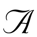 |
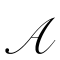
The upper-case 'A' bar is drawn as a separate stroke and flourish on top.
|