 |
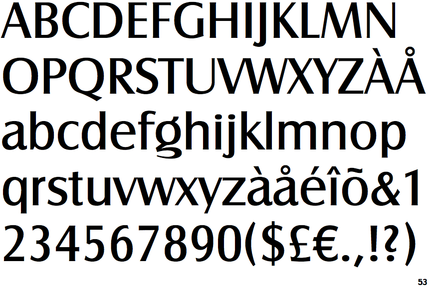
The '$' (dollar) has a single line crossing the 'S'.
|
 |
The upper-case 'J' descends below the baseline.
|
 |
The '4' is closed.
|
 |
The centre vertex of the upper-case 'M' is on the baseline.
|
 |
The verticals of the upper-case 'M' are sloping.
|
 |
The upper-case 'G' has no bar.
|
 |
The upper-case 'Y' arms and tail are separate strokes.
|
 |
The leg of the upper-case 'R' is straight.
|
 |
The lower-case 'e' has a straight horizontal bar.
|
 |
The lower-case 'u' has a stem/serif.
|
There are more than ten differences; only the first ten are shown.
Note that the fonts in the icons shown above represent general examples, not necessarily the two fonts chosen for comparison.
Show Examples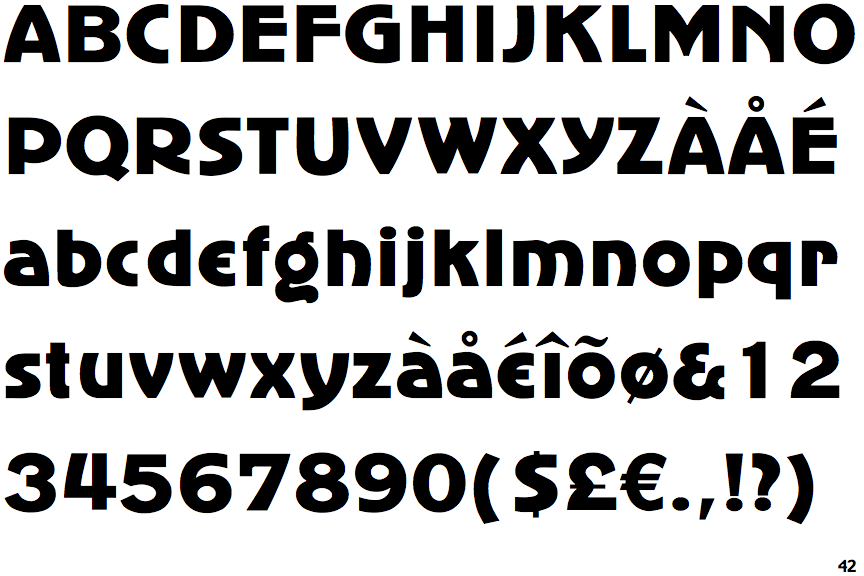
 |
The '$' (dollar) has a single line which does not cross the 'S'.
|
 |
The upper-case 'J' sits on the baseline.
|
 |
The '4' is open.
|
 |
The centre vertex of the upper-case 'M' is above the baseline.
|
|
The verticals of the upper-case 'M' are parallel.
|
 |
The upper-case 'G' has a bar to the left.
|
 |
The upper-case 'Y' right-hand arm forms a continuous stroke with the tail.
|
 |
The leg of the upper-case 'R' is curved inwards.
|
 |
The lower-case 'e' is drawn as a 'c' with a bar.
|
 |
The lower-case 'u' has no stem/serif.
|