 |
The upper-case 'Q' tail crosses the circle.
|
 |
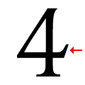
The '4' is open.
|
 |
The diagonal strokes of the upper-case 'K' meet at the vertical (with or without a gap).
|
 |
The centre vertex of the upper-case 'M' is above the baseline.
|
 |
The top storey of the '3' is a sharp angle.
|
 |
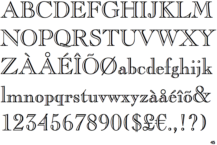
The characters are outlined, shaded, or filled with a pattern.
|
 |
The top of the lower-case 'q' has a right-facing serif.
|
 |
The foot of the '4' has no serifs.
|
 |
The centre vertex of the upper-case 'W' has two separate serifs.
|
 |
The bar of the '4' has no serifs or spur.
|
There are more than ten differences; only the first ten are shown.
Note that the fonts in the icons shown above represent general examples, not necessarily the two fonts chosen for comparison.
Show Examples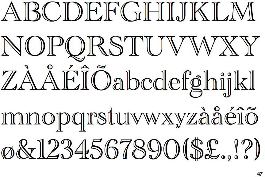
 |
The upper-case 'Q' tail touches the circle.
|
 |
The '4' is closed.
|
 |
The diagonal strokes of the upper-case 'K' meet in a 'T'.
|
 |
The centre vertex of the upper-case 'M' is on the baseline.
|
 |
The top storey of the '3' is a smooth curve.
|
 |
The characters are solid.
|
 |
The top of the lower-case 'q' has a vertical or slightly angled spur (pointed or flat).
|
 |
The foot of the '4' has double-sided serifs.
|
 |
The centre vertex of the upper-case 'W' has no serifs.
|
 |
The bar of the '4' has a single spur.
|