Identifont

Fonts by Appearance

Fonts by Name

Fonts by Similarity

Fonts by Picture

Fonts by Designer/Publisher

Differences

TweetTweet Differences

Compare: and  

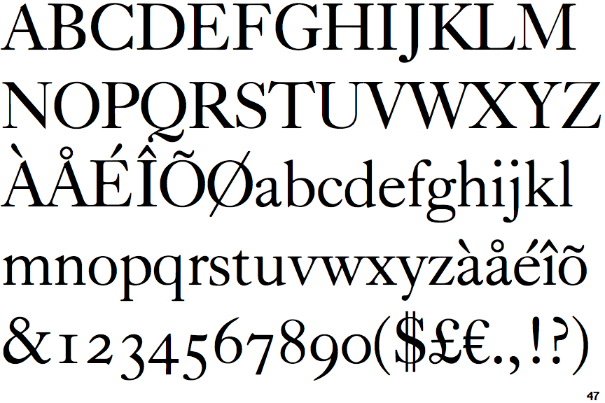
Caslon Classico

Caslon Classico

Closed
The '&' (ampersand) is traditional style with two enclosed loops.
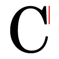
Vertical
The top serif of the upper-case 'C' is vertical or nearly vertical.

Note that the fonts in the icons shown above represent general examples, not necessarily the two fonts chosen for comparison.

Show Examples
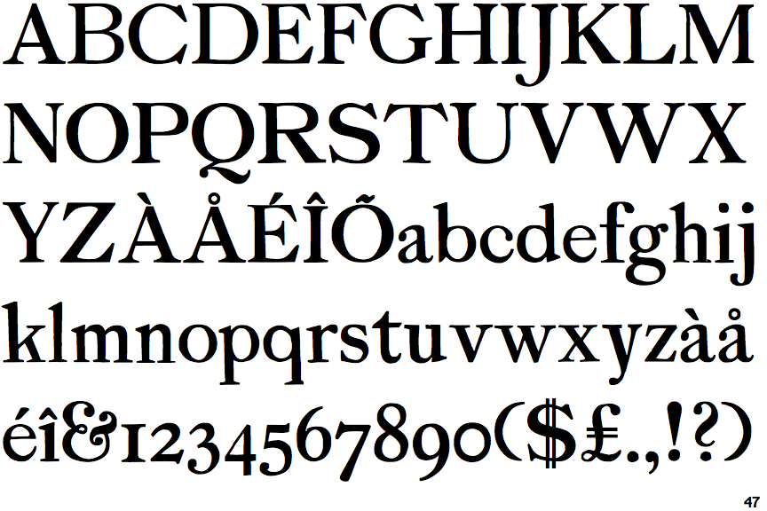
P22 Sherwood

P22 Sherwood

Gap top
The '&' (ampersand) looks like 'Et' with a gap at the top.
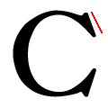
Left
The top serif of the upper-case 'C' is angled left.